
Rocket Deign System

The rocket design system (RDS) is where we collect our best solutions for how to design and build unified digital experiences for the Rocket brands.
"Before 2020, we had a design system called Spark, which served Quicken Loans. Since then, Quicken Loans changed to Rocket Mortgage, and Rocket Families acquired Truebill and changed its name to Rocket Money. As a result, the design system team began building a new system called the "Rocket Design System" to replace the old one."
Introduction
Rocket Design System Support Multi-products






Key Impact
After launching the Rocket Design System, we measured our impact using surveys, interviews, and Figma library analytics. It turns out that the adoption of our new design system has greatly improved.
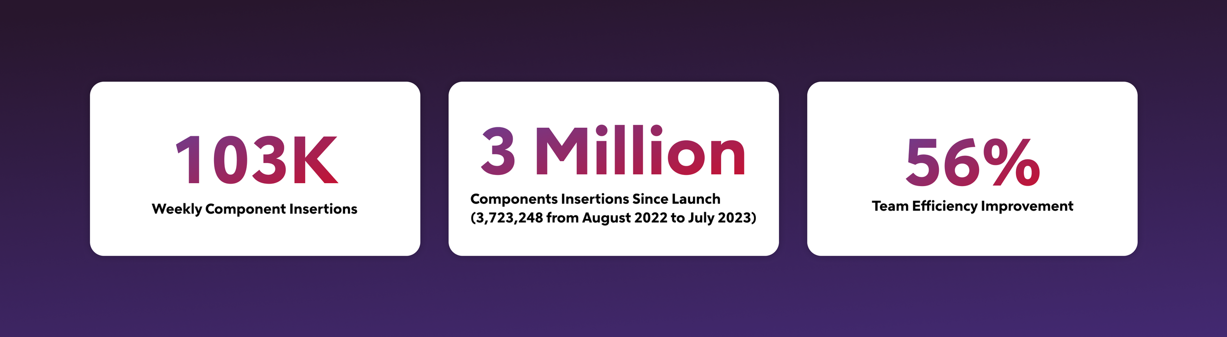
Rocket Design System At A Glance
-
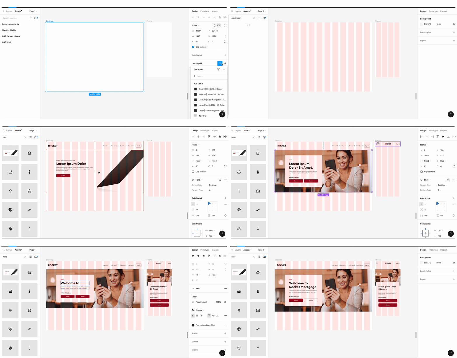
Library in Figma
-
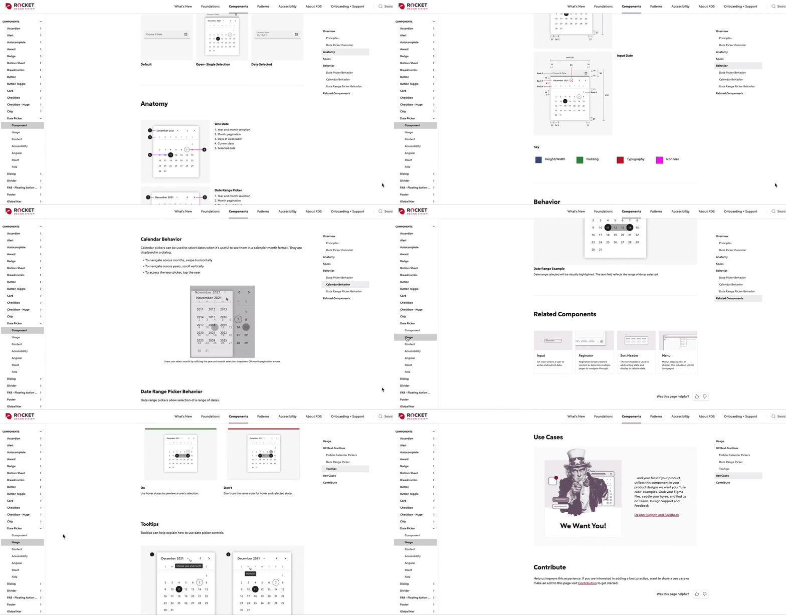
Documentation in ZeroHeight
-
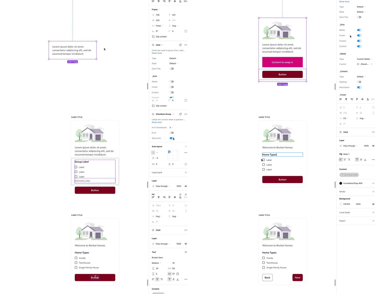
Components with Variants
-
Partial Accessibility Consideration
The Challenge

01 Lack Of Design System Knowledge
"During the pandemic (2020-2022), the mortgage and home purchase markets were extremely active, resulting in our design team expanding rapidly to support the increased demand. However, approximately 60% of our designers did not have a deep understanding of the system, and 15% had never used it before. As a result, it has been a challenge for me to build trust in the value of the design system and encourage designers to be productive with it.
This is an excellent opportunity for me to promote a design system mindset that helps designers with their work. By emphasizing the "flexibility" of the design system, we can encourage creativity and ensure that the system is not limiting their work."
02 Stakeholders Are Not In The Design System Team
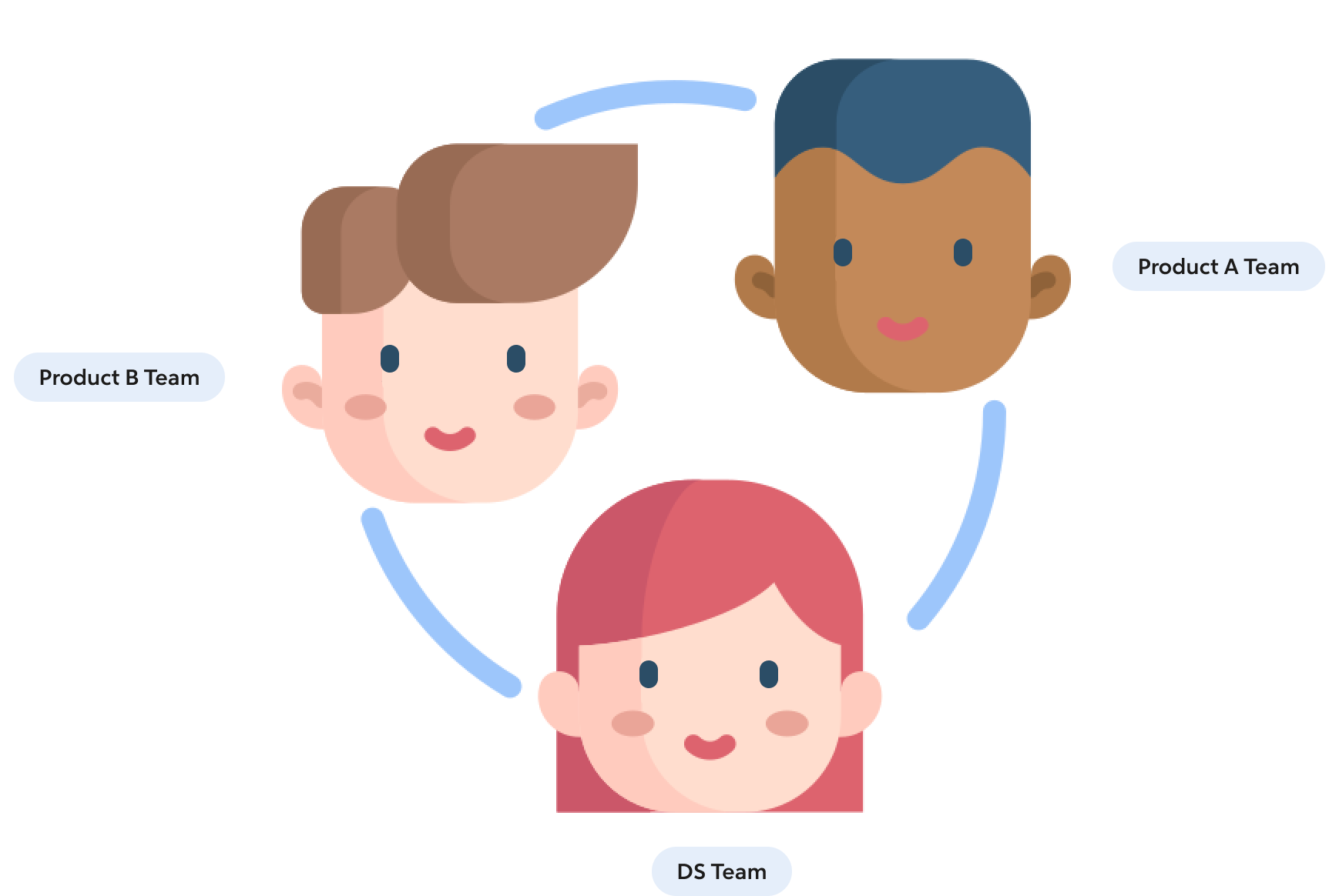
The design system team was an independent team within the organization that documented design guidelines and built the infrastructure of design tools and design tokens. However, since key stakeholders such as the design director and engineering leaders were not part of the team, frequent communication with them became essential to making progress on building the design system. The purpose of these communications with stakeholders was:
To get up-to-date information on the UI reviewed with different teams.
To confirm that the design guidelines we consolidated from the Rocket UIs were aligned with the stakeholders' expectations.
My Role
Design Guilder& Editor.
Conducted a visual audit, documented the visual design language, and defined the usage of the components in ZeroHeight.
Created components, patterns, and built a UI kit to ensure that the components are fully responsive, accessible, and robust.
Checked with engineers to ensure that the design file is consistent with the storybook and serves as a single source of truth.
Design System Advocacy
Maintained constant communication with designers and front-end engineers to increase visibility into the vision of the system and reduce confusion about component usage.
Co-hosted design system office hours and reviewed mid-level or final-level designs from the multi-product team.
Identify Problems
There is nothing better than learning from the Past
The Spark Design System has been supported in 10+ products, however, we have found that there are more than 10 different styles for buttons alone!
What we found:
Insufficient documentation of components usage.
Lack of accessibility of components.
Only focus on the desktop of UI Kit.
Low adoption rates in previous style guides in products.
Process ( Alert As an Example)
-
![]()
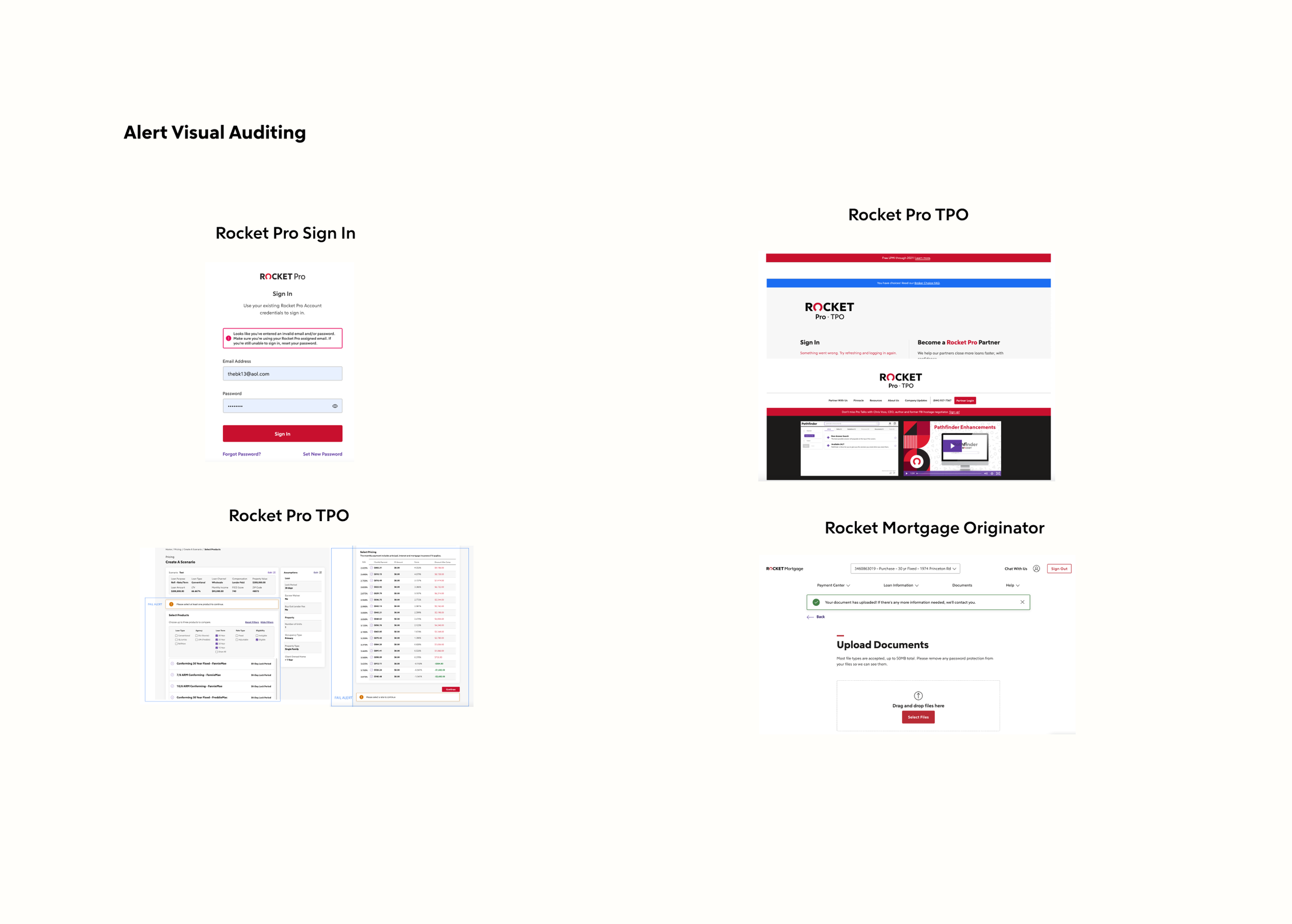
01 Visual Audit
Understanding the specific contexts in current products is very important in order to align with business goals and to identify the problems among different products.
-
![]()
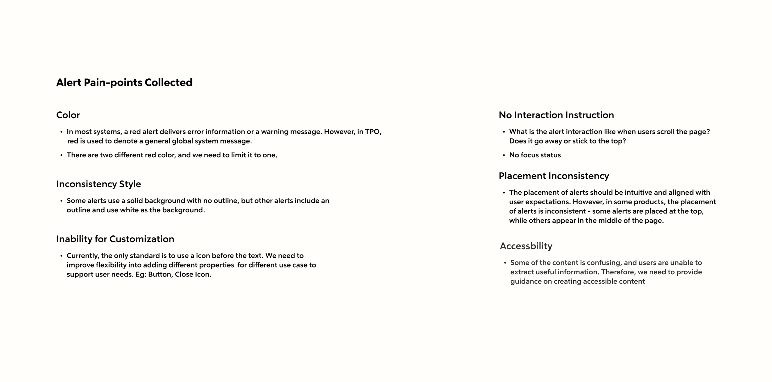
02 Identity Pain-points With Designers
Write down different pain points and talk to product designers who have used these components in the past, helping me fully understand the root causes of issues in various use cases or potentially uncovering more problems.
-
![]()
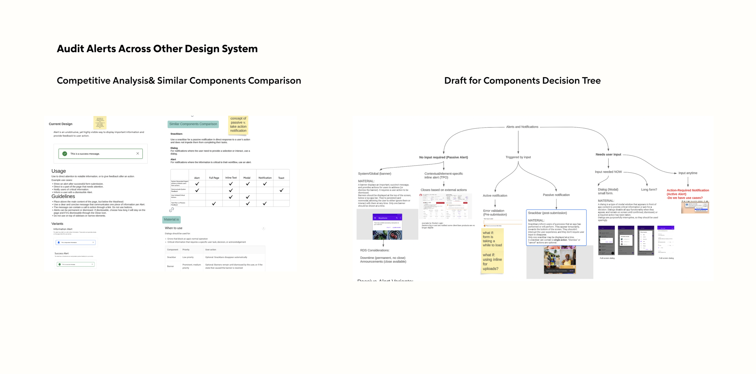
03 Competitive Analysis
Conducting a competitive analysis can provide a solid foundation for us. It gives us a different lens through which to view interaction, visuals, accessibility, and usage.
-
![]()
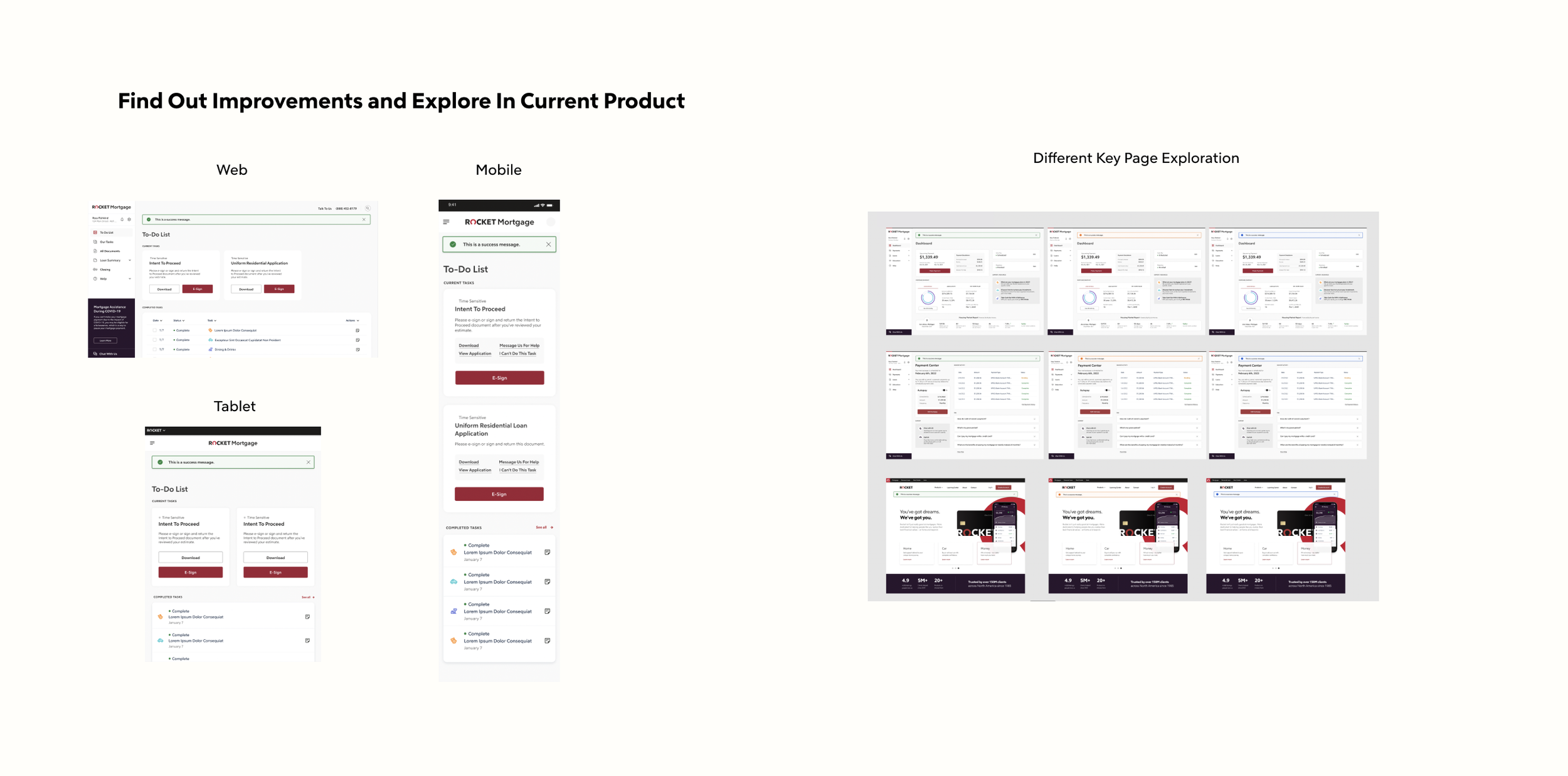
04 Known Improvements and Explore Ideal Components On Current Page
After identifying the pain points and conducting research, it's time to explore the concepts of different pages and devices.
-
![]()
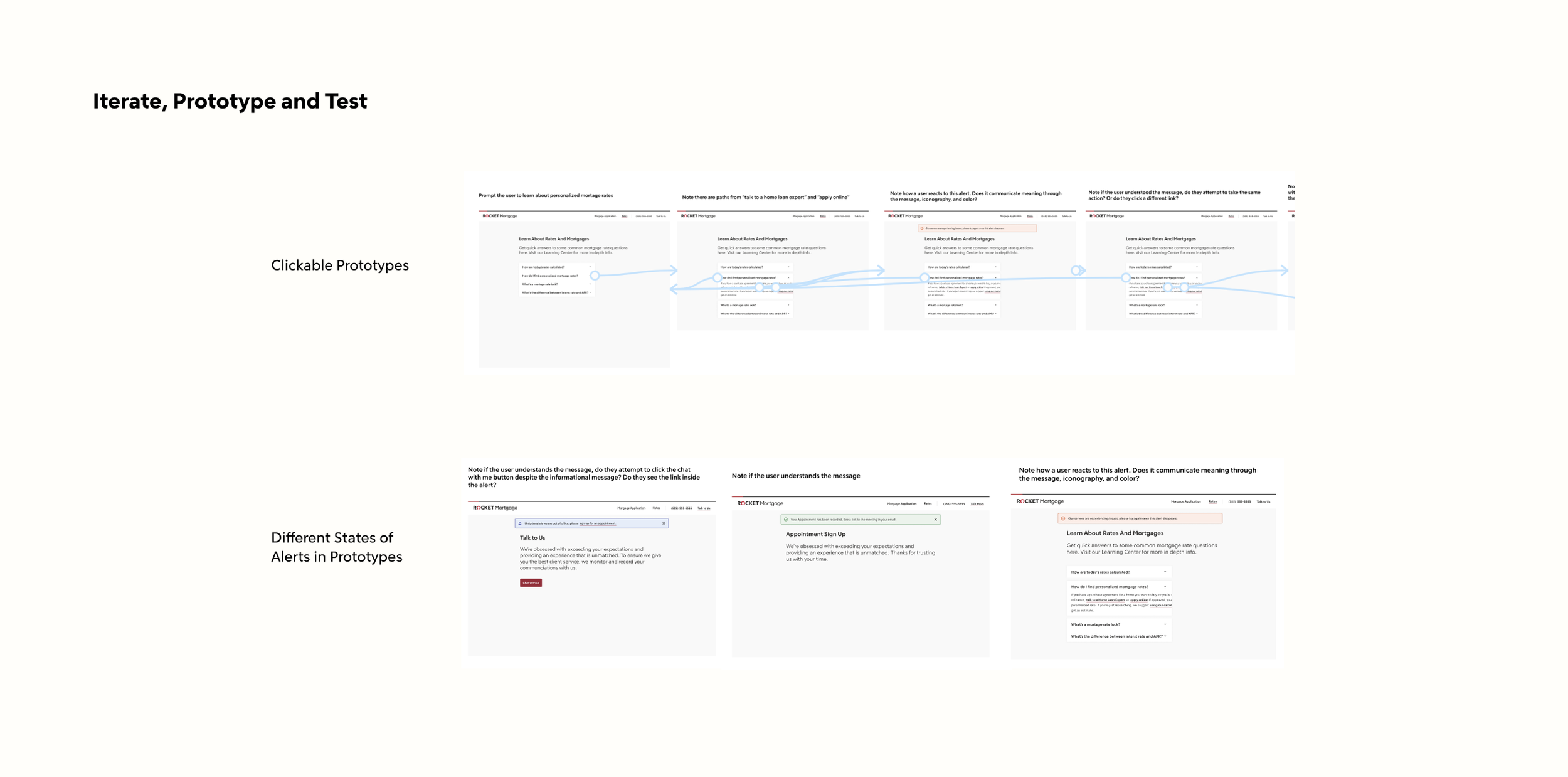
05 Iterate, Prototype, Test and Summarize Feedback
Put the concept of the component into user flows and create clickable prototypes, then share these with designers for testing. Continue to make changes based on their feedback.
-
![]()
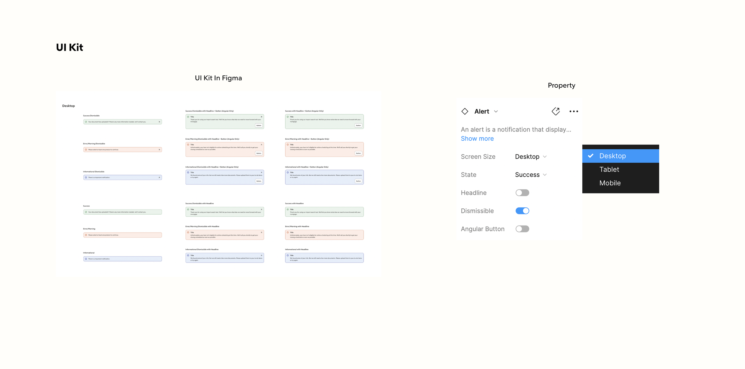
06 Define Guidelines and Create Master Components In UI Kit
After finalizing the components, it's time to create versions with different states or interactions for the components library in Figma.
-
![]()
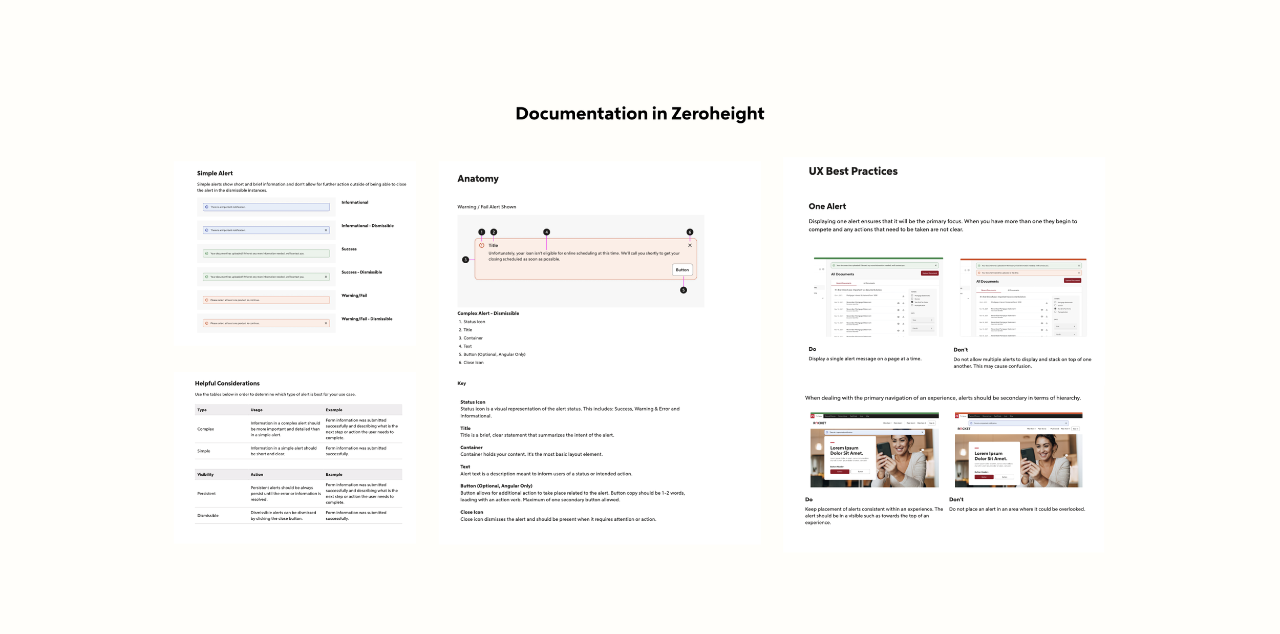
07 Working On Documentation in ZeroHeight
Information of components will be documented for designers, developers, content designers, or other stakeholders in Zeroheight.
Foundations
The Rocket Design System works very closely with the brand team, ensuring that the design system reflects the look and feel of Rocket's branding. Our foundations support grid systems, spacing scales, typography scales, color systems, and interactive language.
Colors
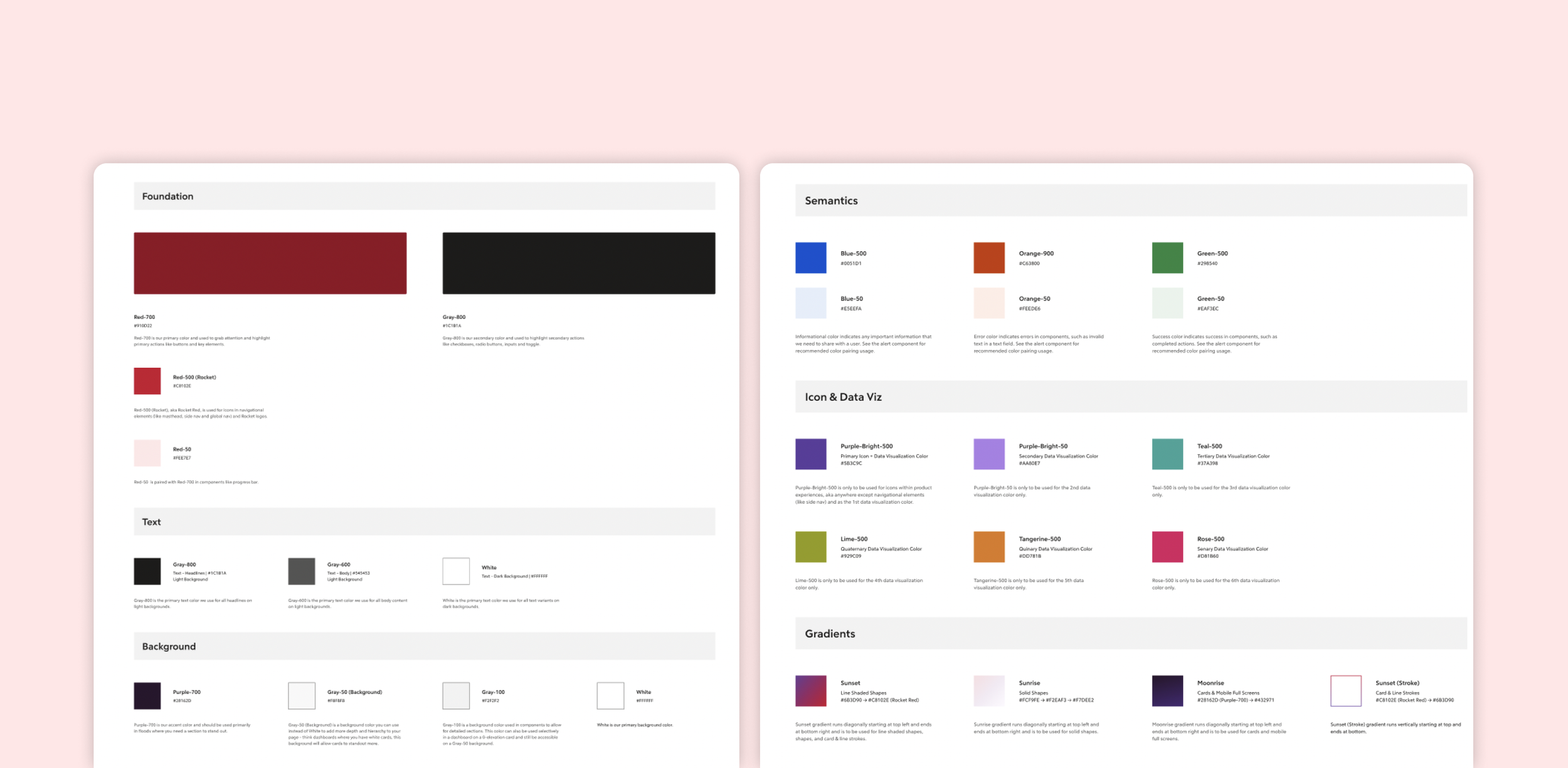
In the color palette, we provide colors within clear naming groups: Primary Colors, Secondary Colors, Semantic Colors, Gradient Colors, Background Colors, Text Colors, and Icon& Data Visualization Colors. This naming structure and usage is clear and easy for designers to use the correct colors in their design work without hesitation.
Typescale
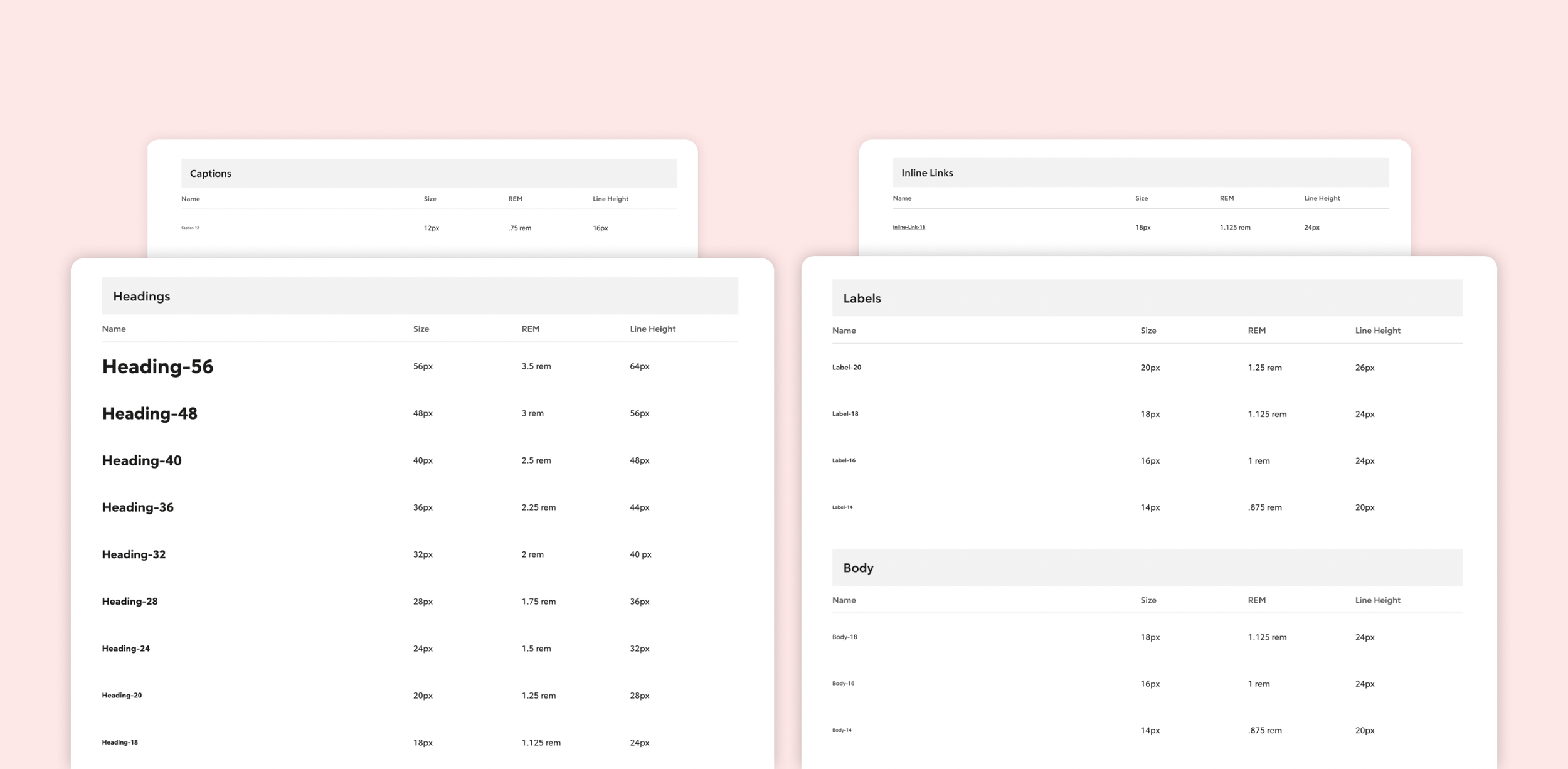
We introduce a type scale based on Heading, Body, Label, Link, Caption, Tracked, and Decorative along with responsive guidance. Designers can choose the correct text style and size in a better way.
Grid &Spacing& Icon
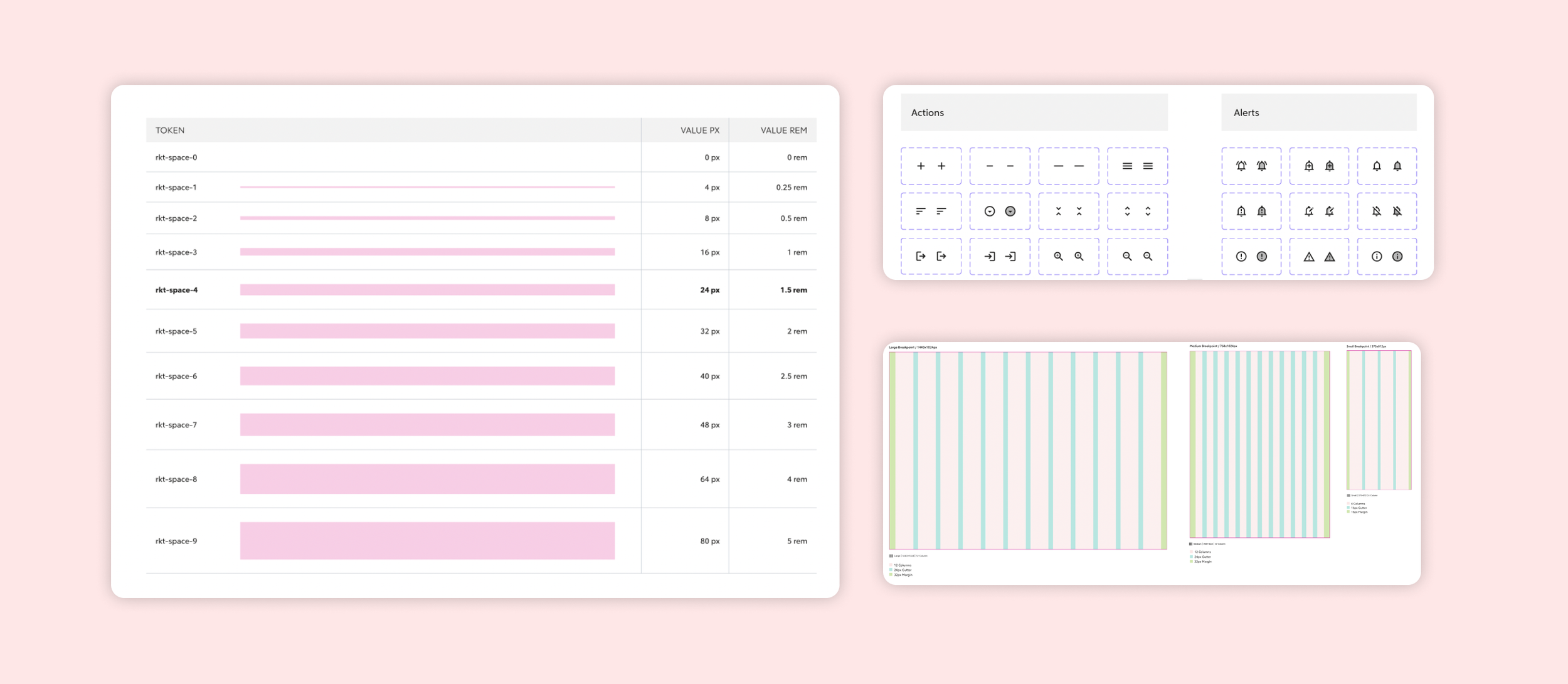
We provide a grid system for desktop, tablet, and mobile devices, along with an icon kit and a space scale, to help designers adapt to different screen sizes and create interfaces with ease, thereby ensuring a consistent and seamless user experience across in web, tablet, and mobile.
Library
Our library includes a component library, which is a collection of reusable, responsive, and accessible components. Each component has different states and variants, ensuring we provide flexibility for designers.
Different States
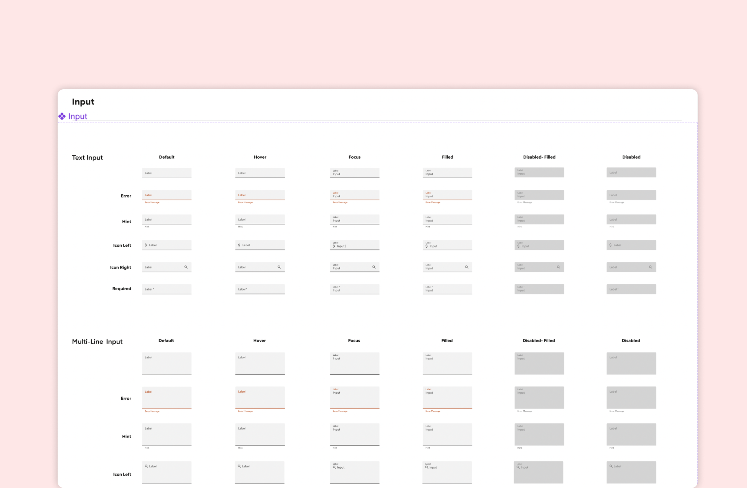
States are fundamental for creating realistic, interactive, and consistent components. Through discussions with developers, designers, and researchers, we ensure that every component has the correct states and clear visuals to communicate effectively with users.
Property in Component
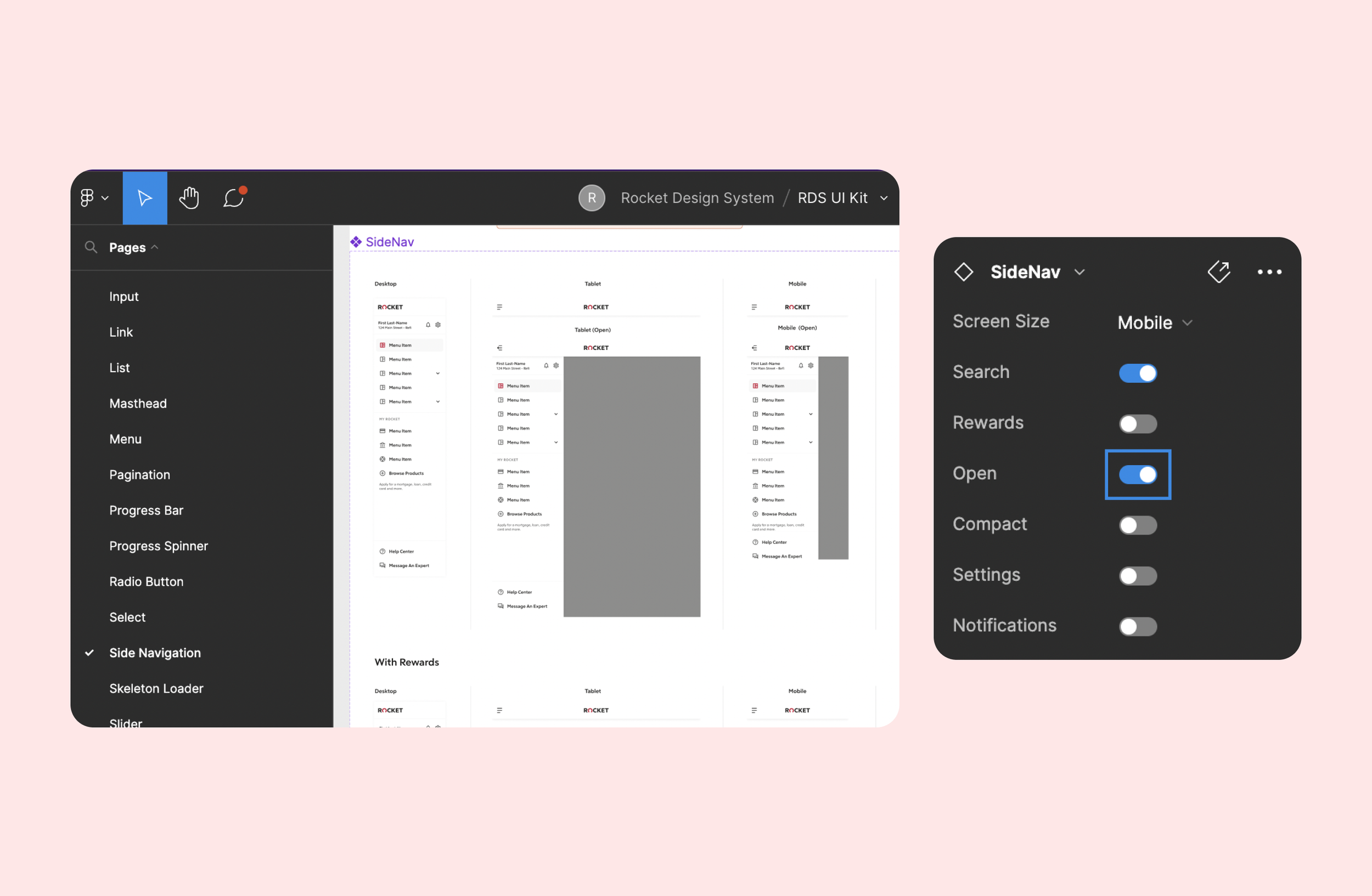
Property empowers the components. We ensure every component has the correct property and allow designers to configure each one based on their needs.
(Property Settings in Side Navigation as a example)
Component’s Architect
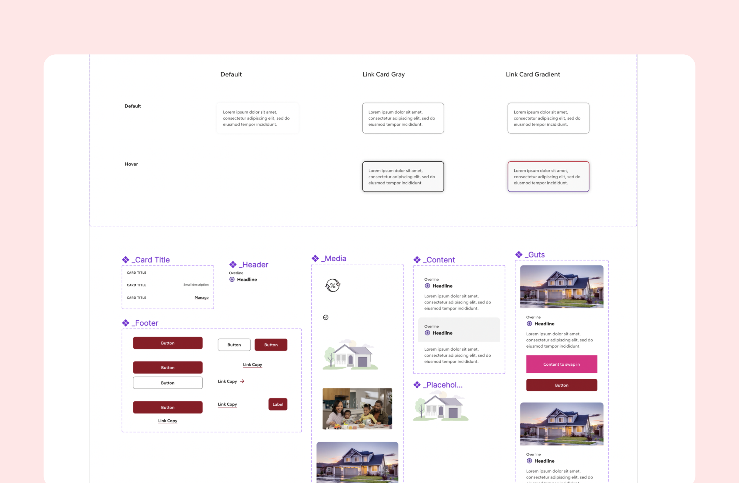
As discussed with the designers, we incorporated nested components into parent components to provide flexibility. This not only reduced the number of parent component variants but also ensured that designers could use these components with improved efficiency and consistency, thereby increasing user adoption rates.
(Nested Components in Card as a Example)
Pattern
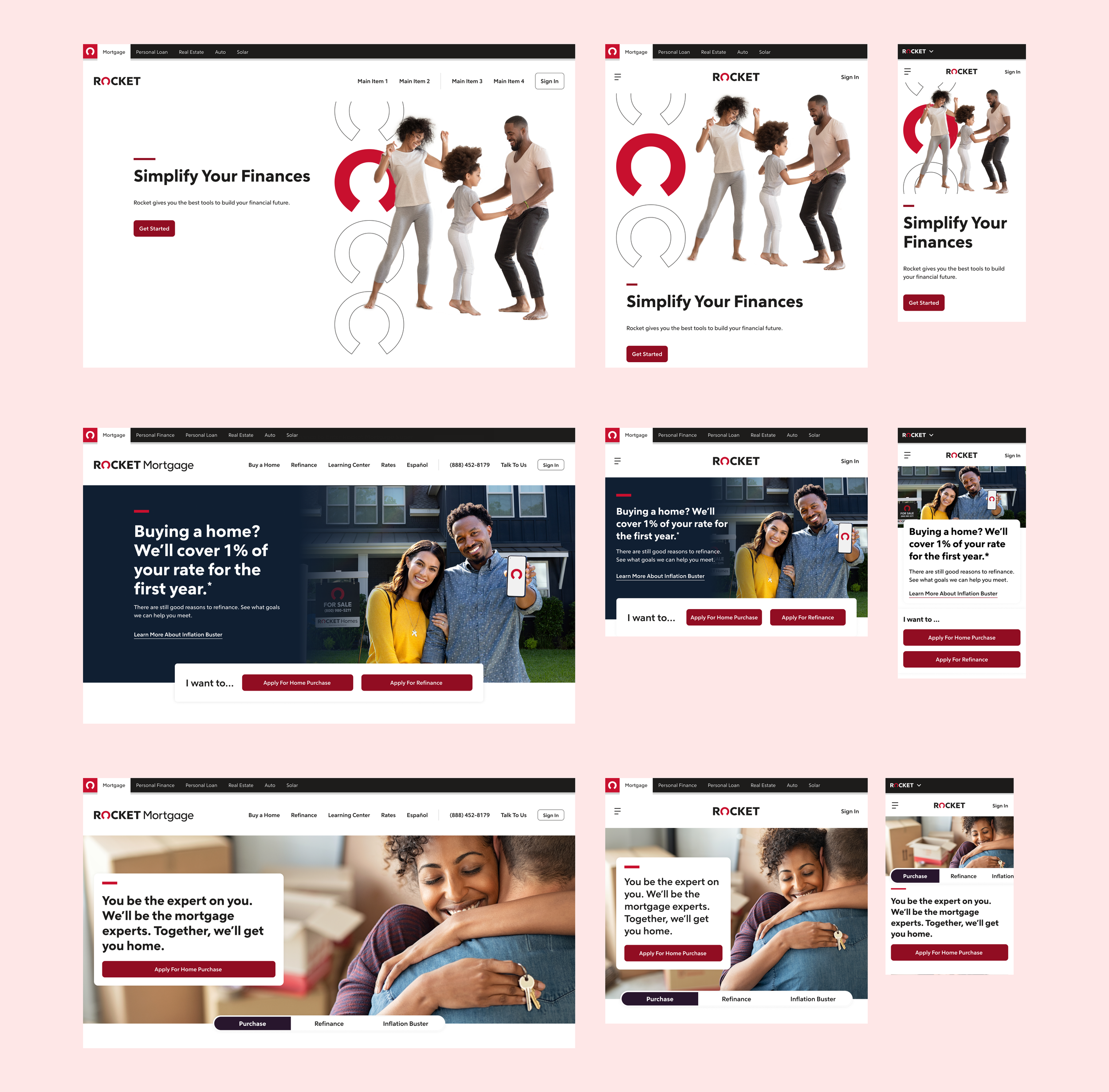
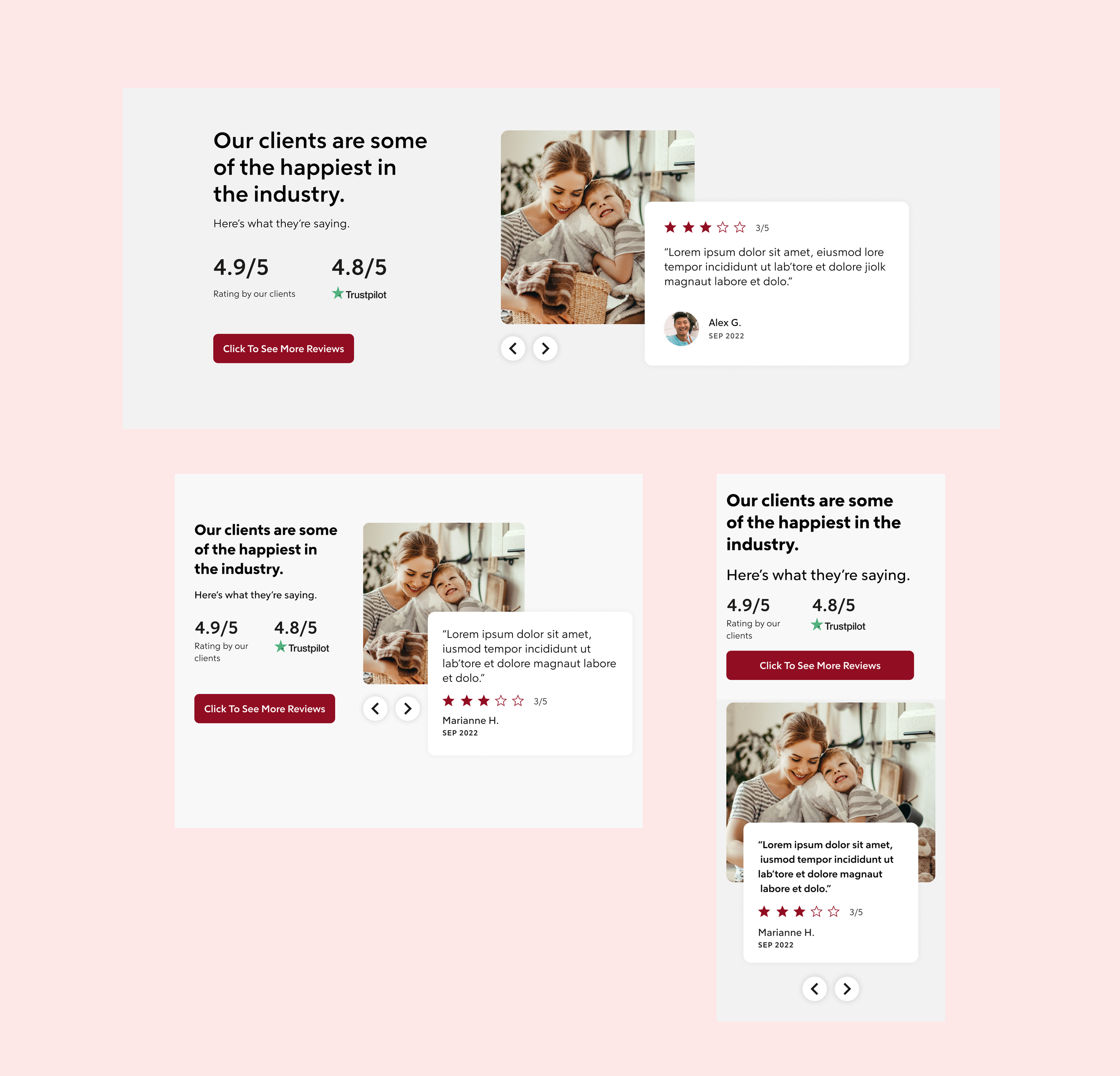
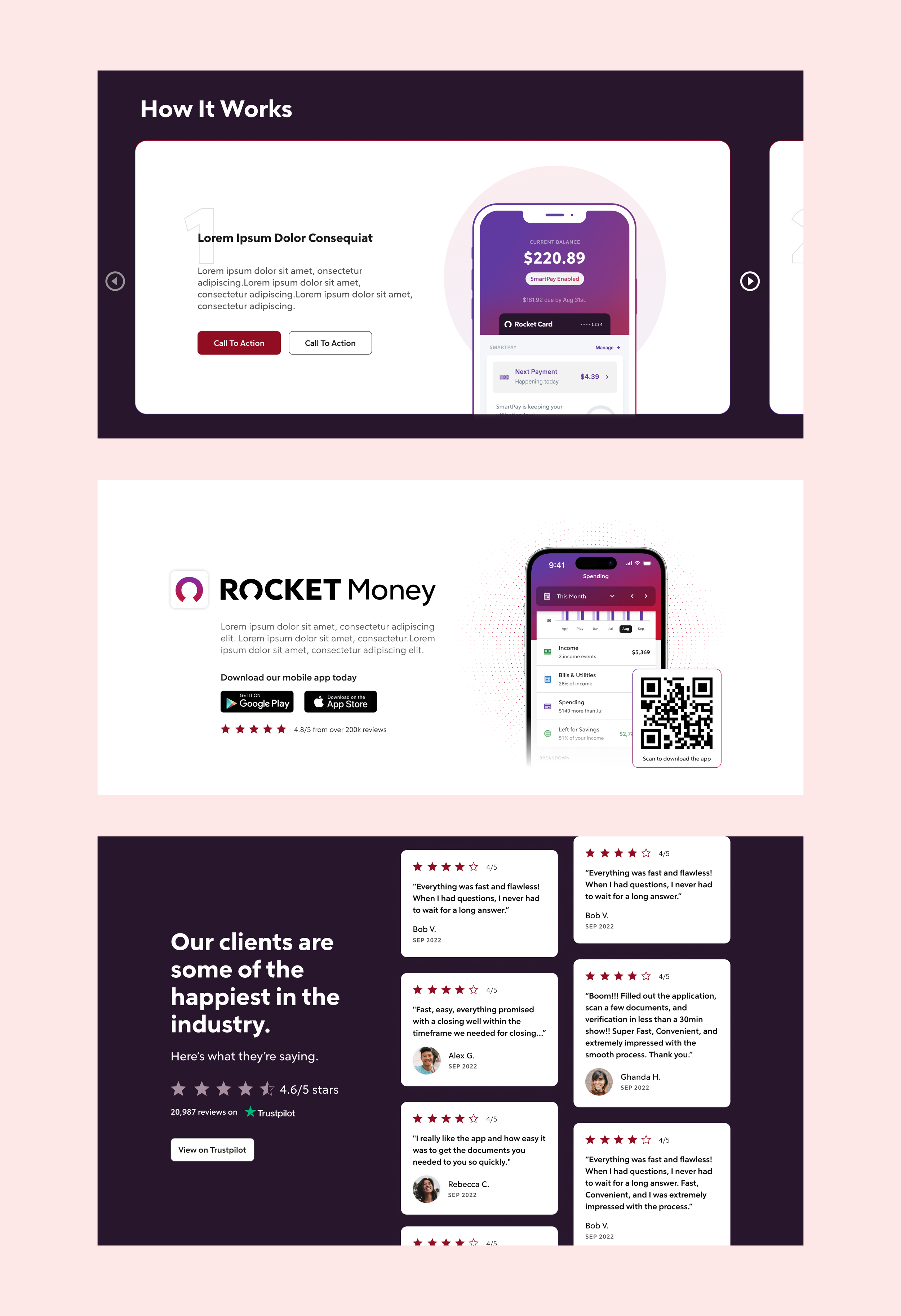
We also provide patterns, which are used to showcase reusable combinations of components that address common user objectives through sequences and flows. Since our main focus is on the storefront business, not every possible pattern has been developed.
Pattern Library (Hero as a Example)
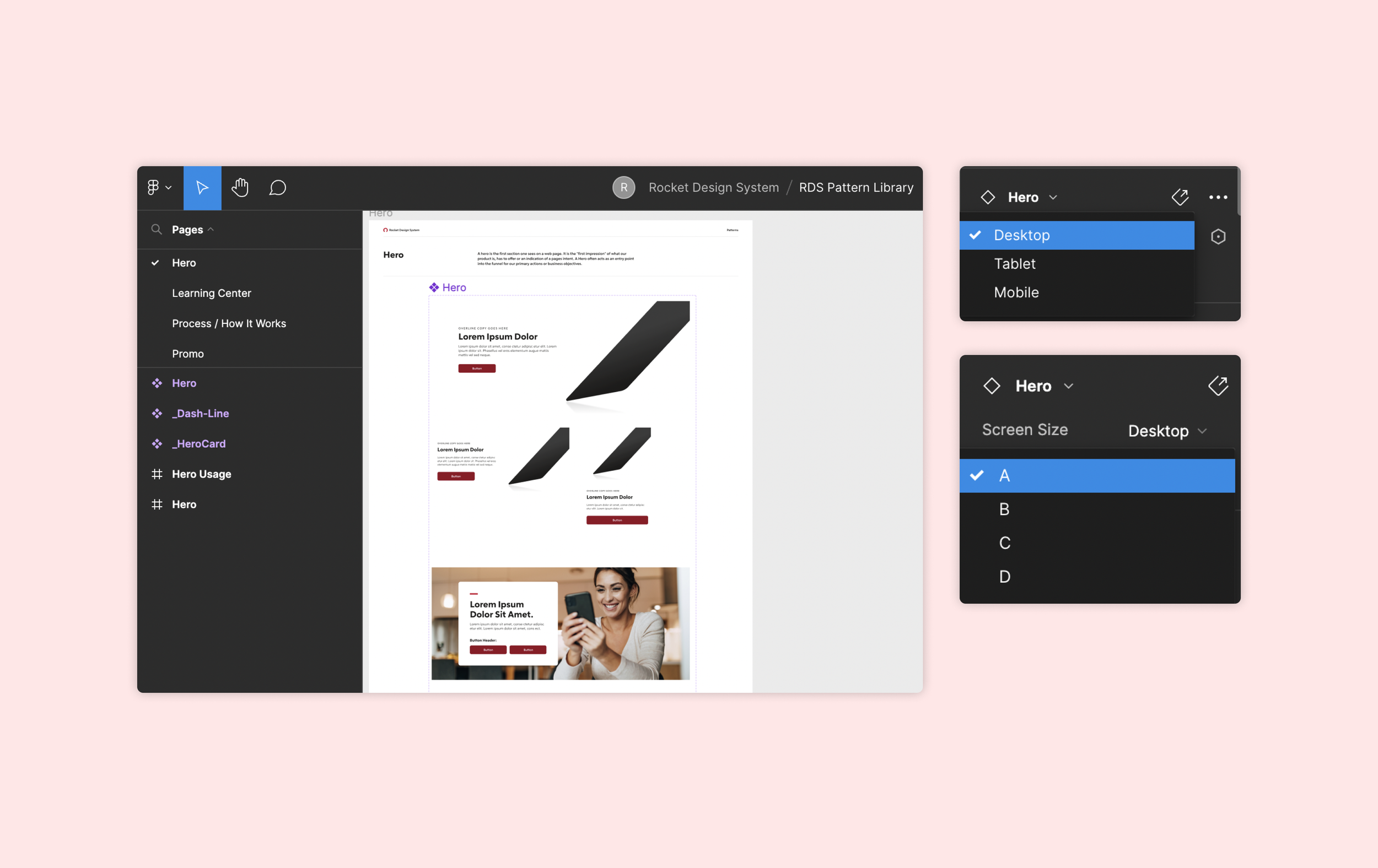
Different Types& Sizes of Hero
Using Figma, we create variations of each pattern for desktop, tablet, and mobile devices. This approach provides greater flexibility, such as the ability to place an image on the left with content on the right, or vice versa.
Testimonial
How It Works
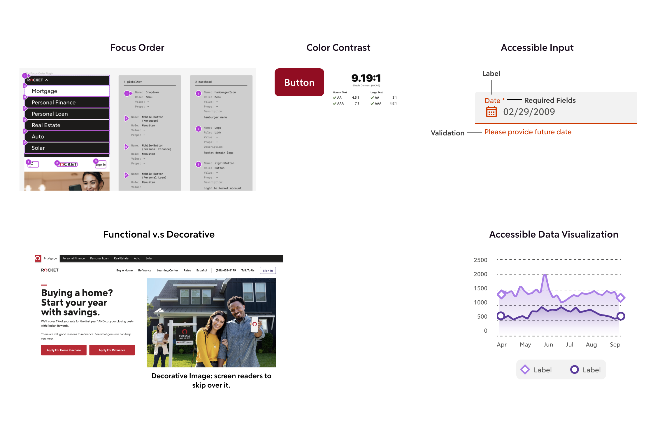
Accessibility
Accessibility is a key consideration for the design system team. Within the product team, there are still many designers who lack a sense of accessibility and knowledge in this area. Therefore, we need to promote this throughout the entire organization and educate other team members.
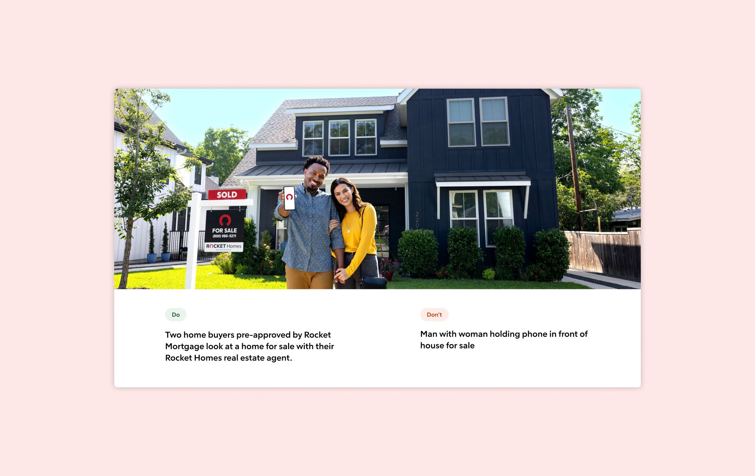
Alternative Text
Alt-text helps identify non-textual content like images or graphics. It aids users with visual disabilities by providing information about what the informative images contain.
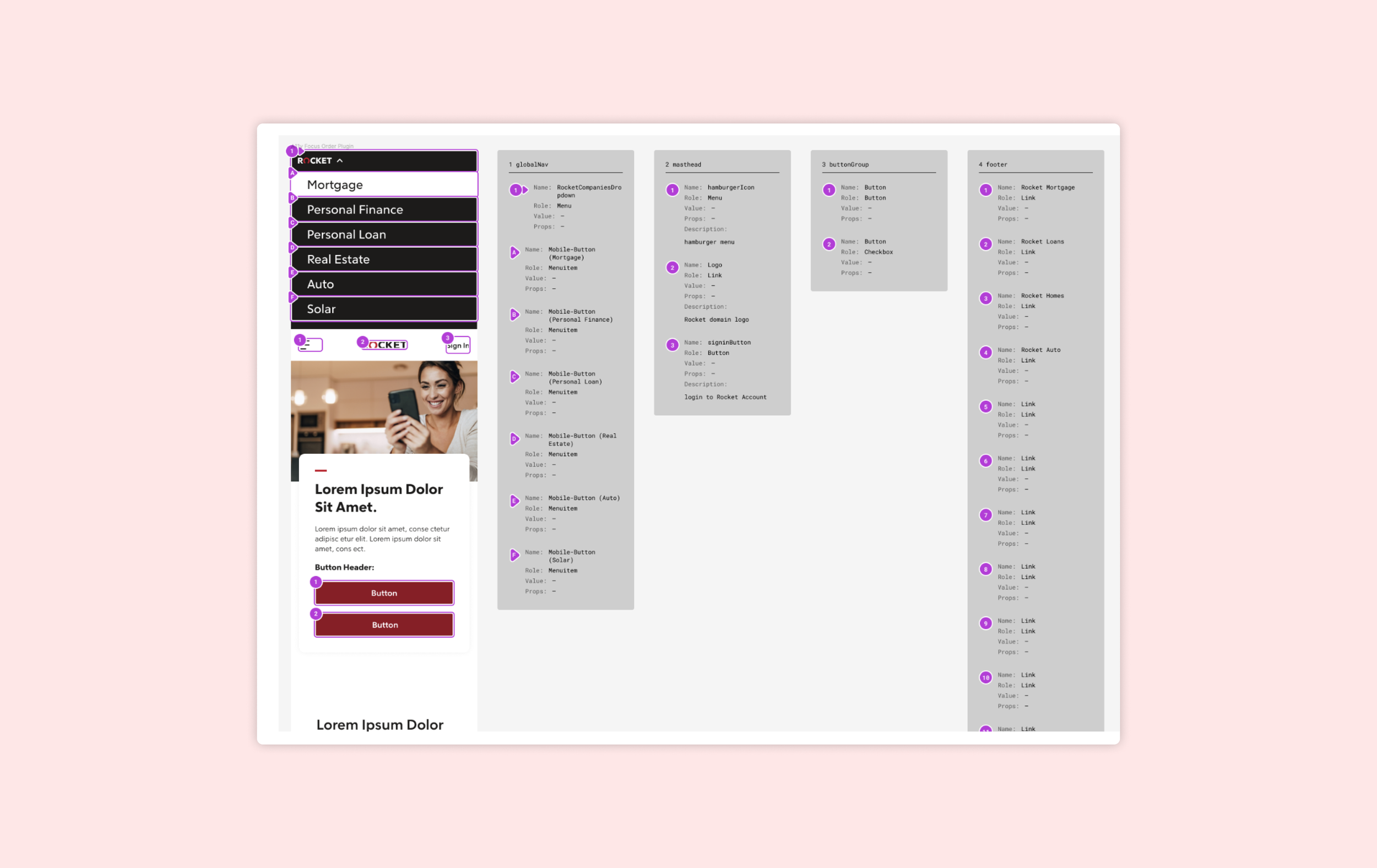
Focus Order
Focus order assigns a clear, meaningful sequence to optimize keyboard navigation. We documented every component and interactive element, providing detailed specifications on how they would operate with the keyboard alone.
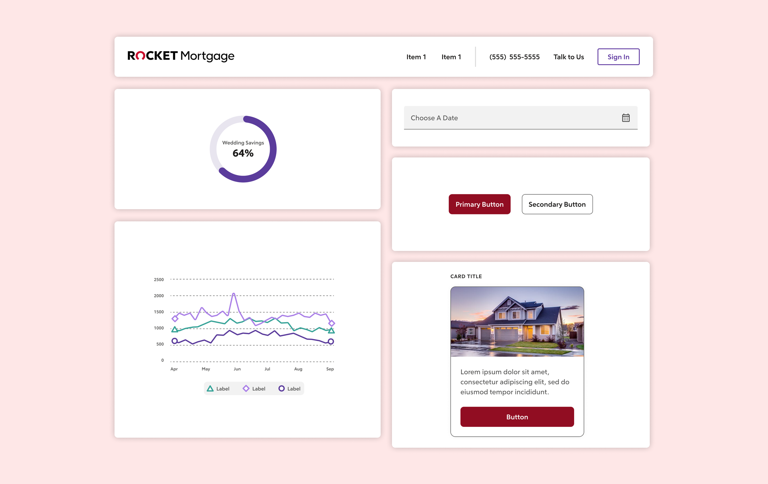
Color Contrast
We tested all the components' color combinations to ensure they have sufficient contrast. This applies to buttons, input elements, headers, data visualizations, cards, icons and so on.
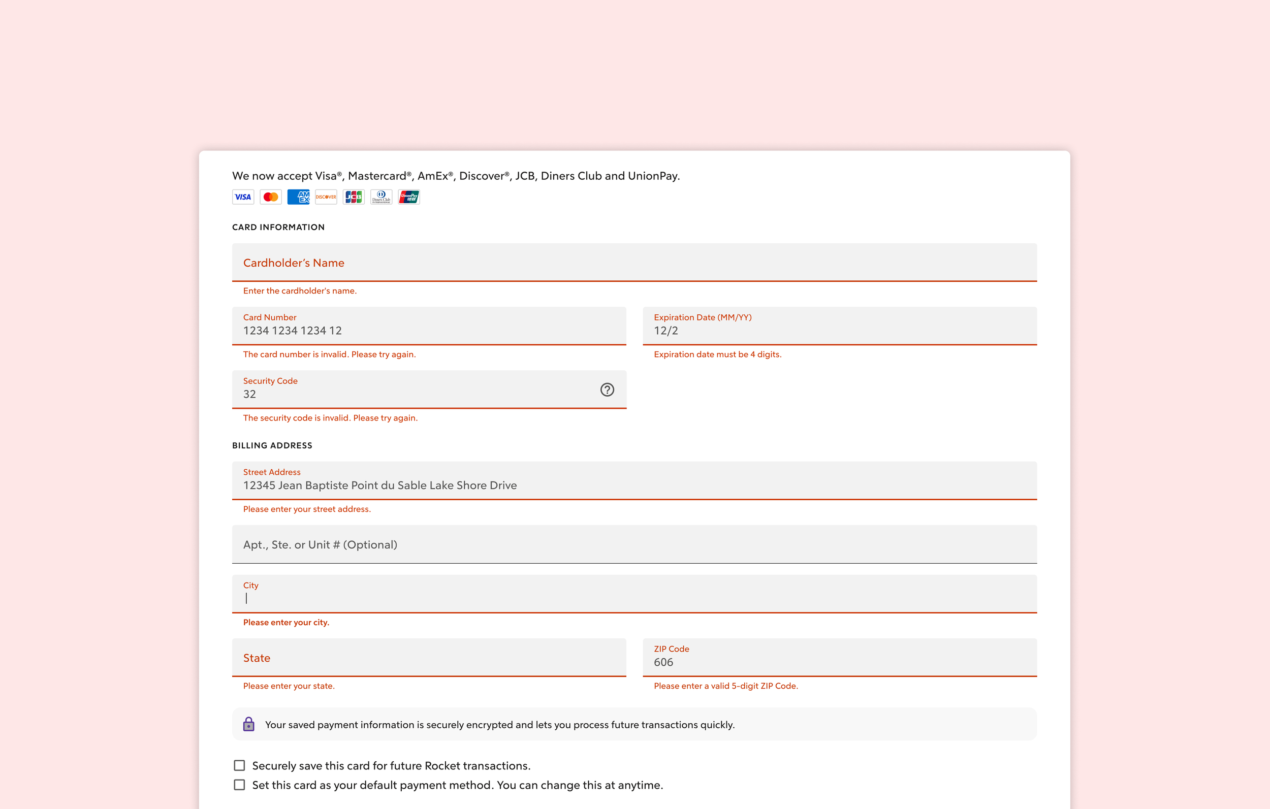
Error Feedback
Error or warning states provide valuable information for our users. We've eliminated confusing language from the system, making it clear and providing solutions. This ensures users can understand how to resolve issues.
Governance& Documentation
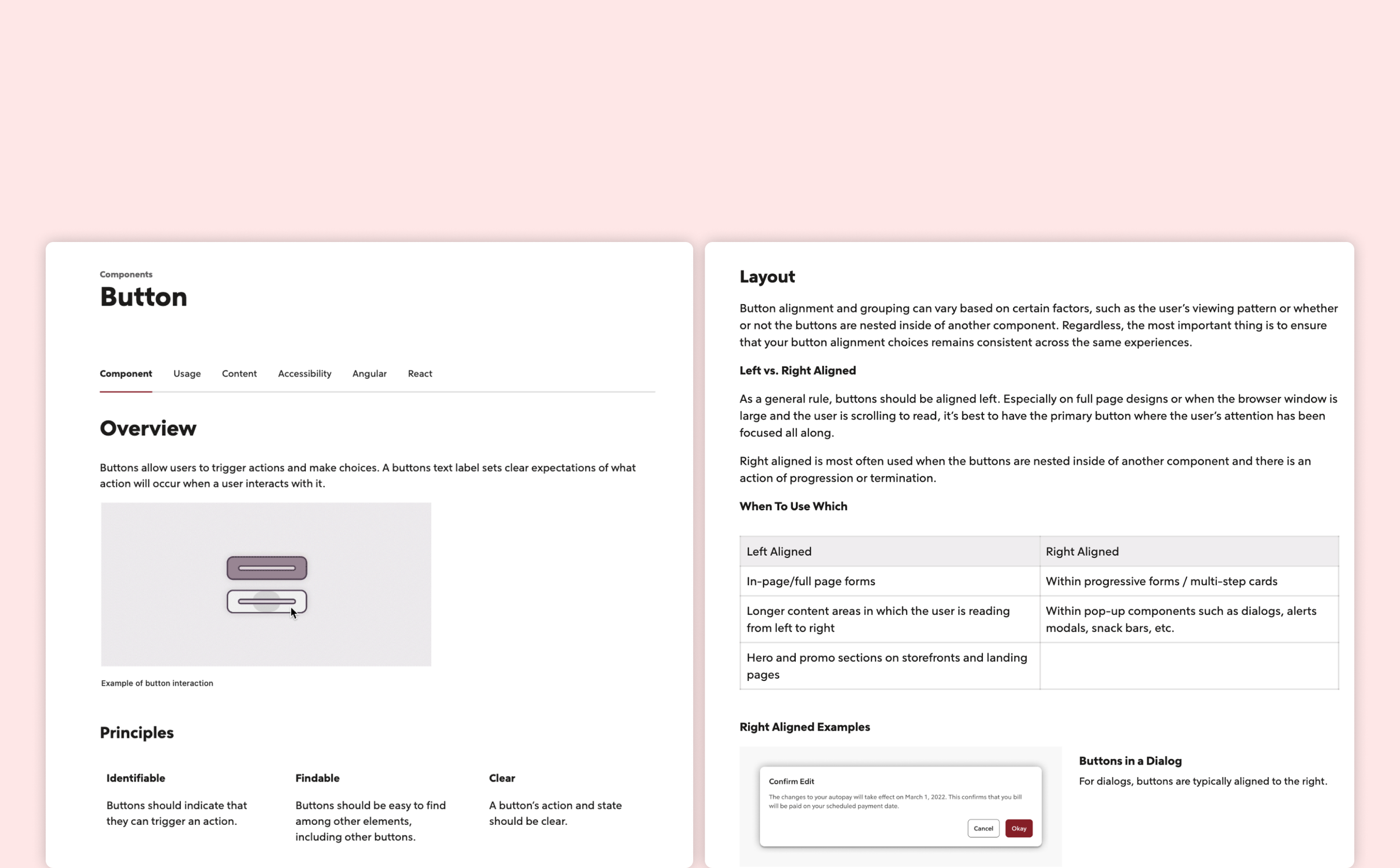
Having documentation and governance in place for the design system is key to its success and sustainability. We use ZeroHeight to document every piece of information in the design system, making it accessible for designers, developers, content designers, and other stakeholders
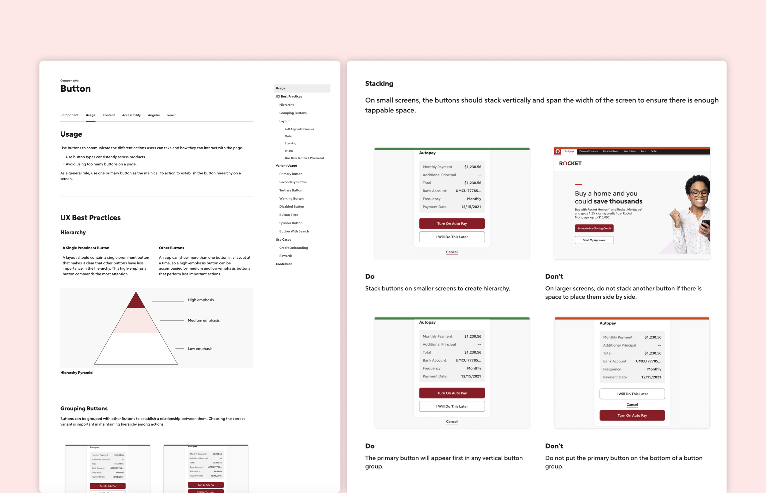
Component Usage
To ensure that designers fully understand and use components correctly, we provide detailed information for each one. Beyond states, specs, and design principles, we also offer 'Do & Don't' examples. This visual approach simplifies understanding, making it quicker and easier than relying on plain text.
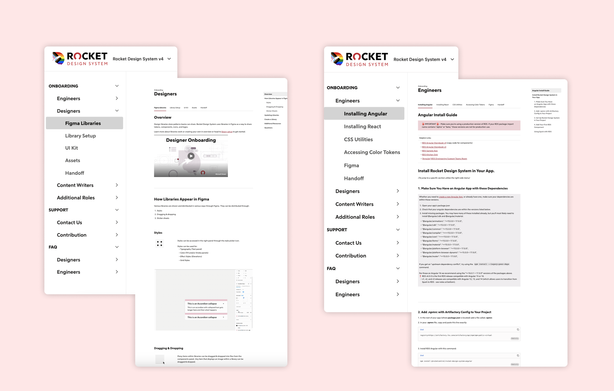
Onboarding
We provide onboarding for designers, engineers, and content designers, as many team members don't have knowledge of design systems. These sessions will help them recognize the power of the design system and get up to speed quickly.
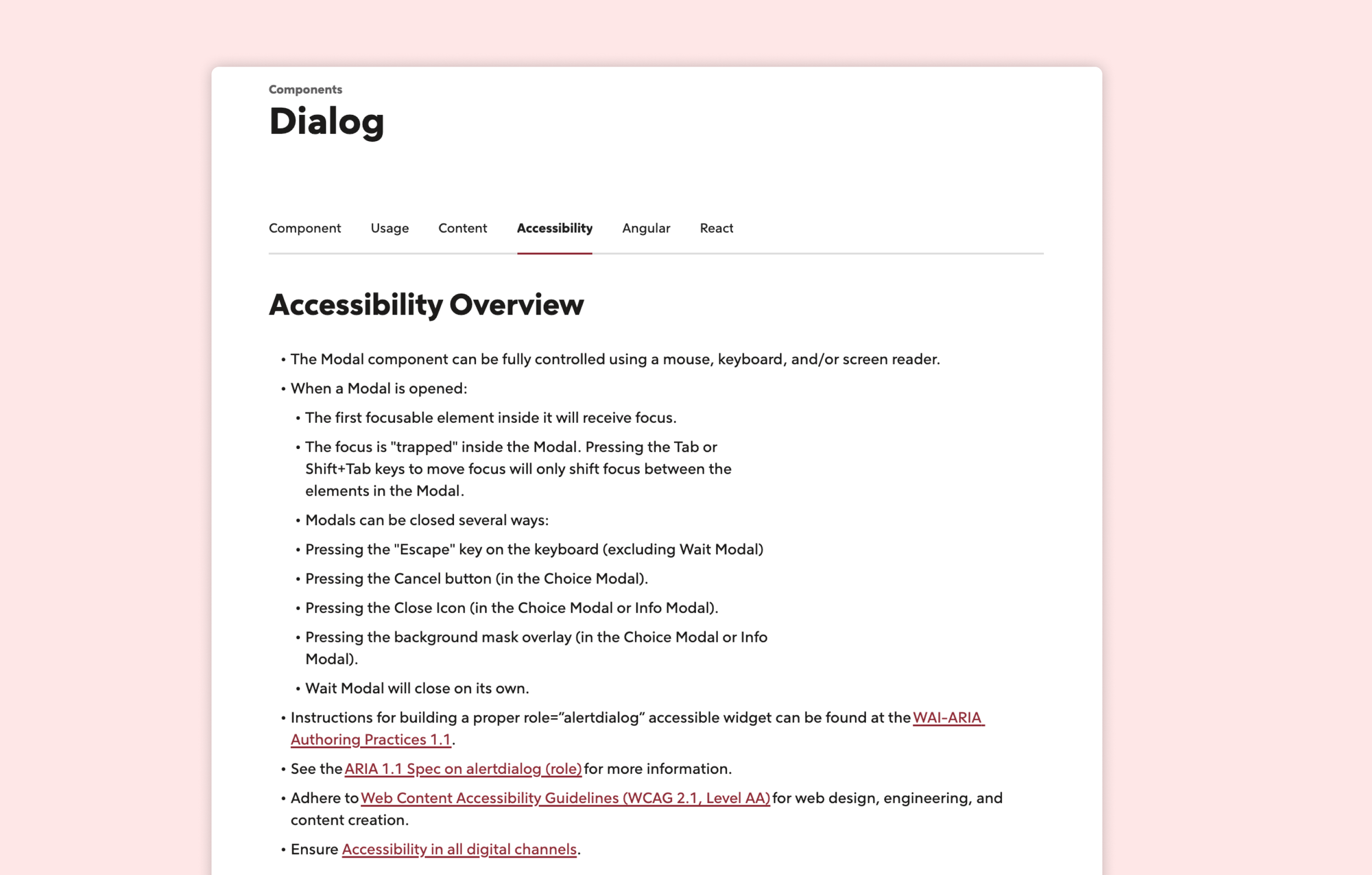
Accessibility
We put the accessibility guidance in the documentation, so designers can easily check it when using these components. Also, attached some links if they want to learn more knowledge.
Updates
To enhance awareness about updates to the design system, our leaders and project managers have documented the changes within our Figma design files. They ensure that with each release, updates are communicated effectively so that everyone, especially designers and developers, knows which components have been updated.
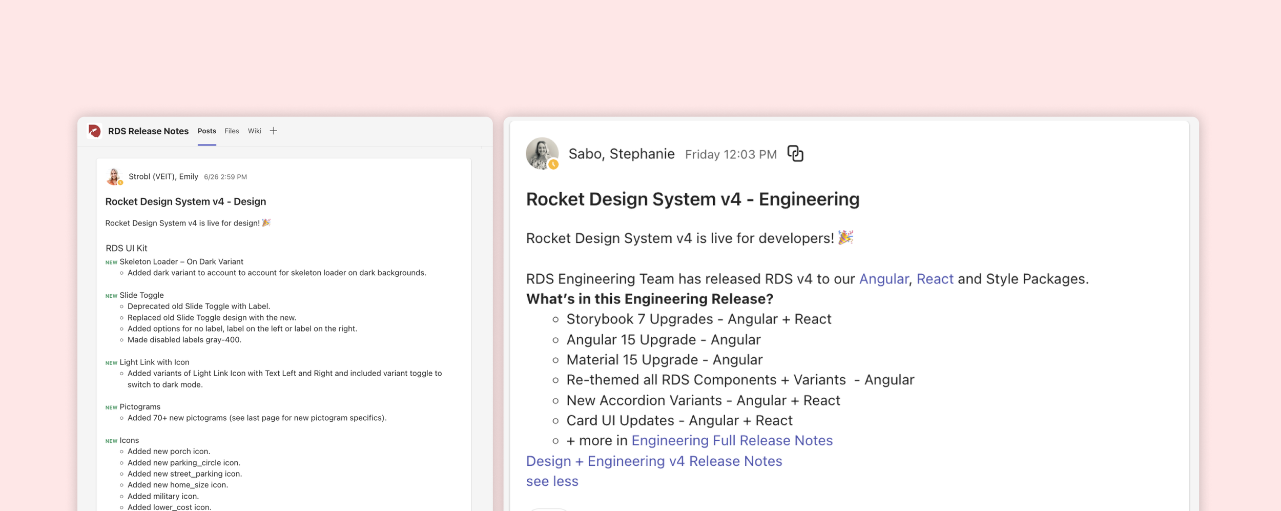
Support&Feedback
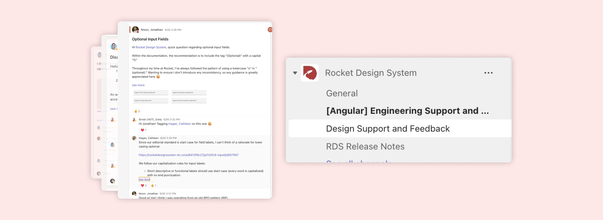
We have created a support channel on Teams to address questions from designers or engineers about the design system.
BeforeV.S After
Let's examine the extent of improvement and consistency achieved across different products by comparing the stages before and after the implementation of our Rocket Design System versus the old design system.
Rocket Auto
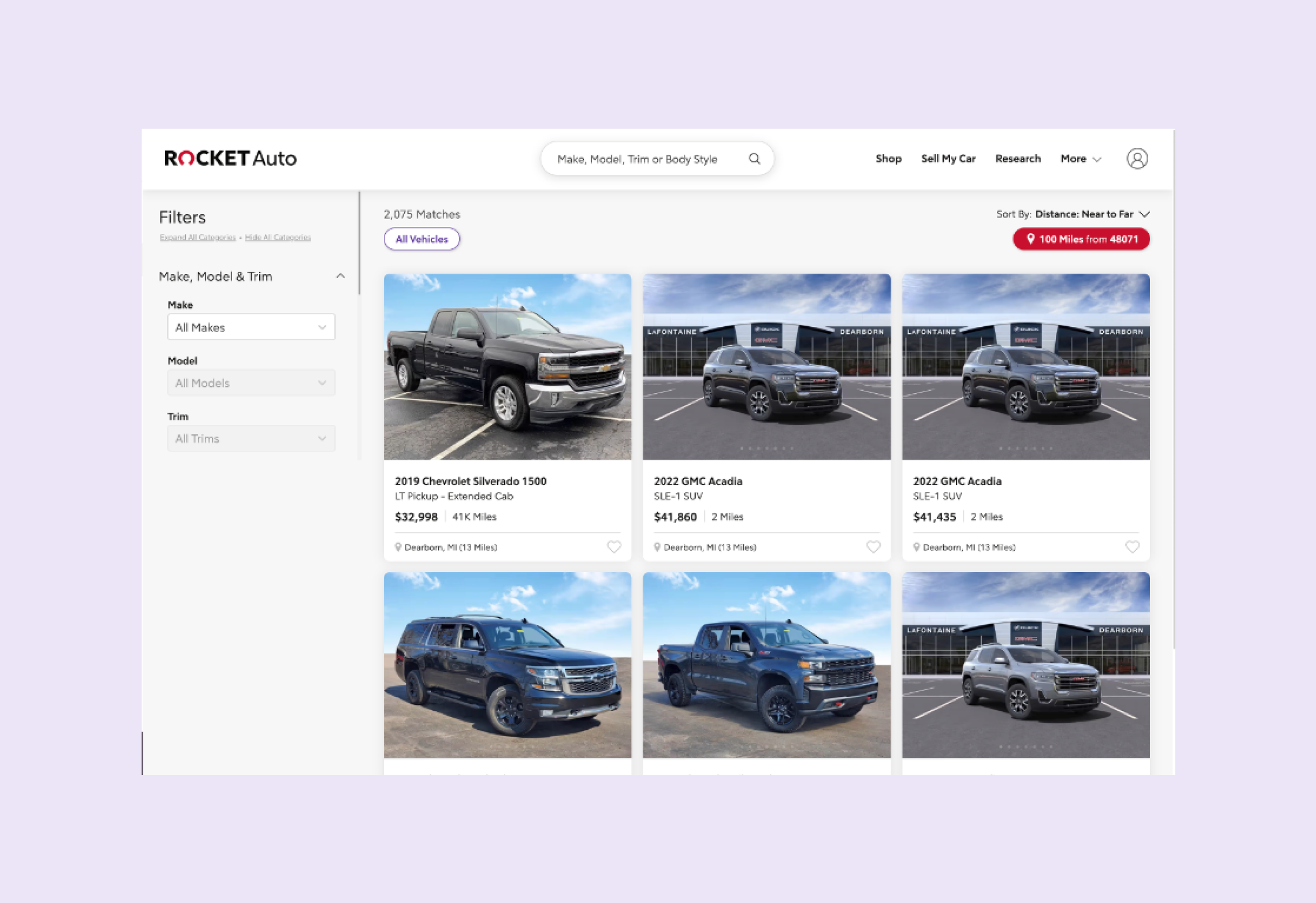
Before
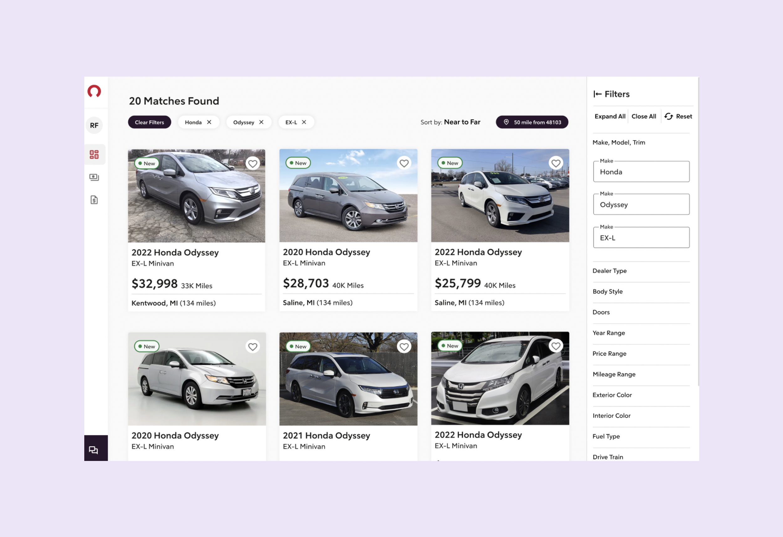
After
Rocket Dashboard
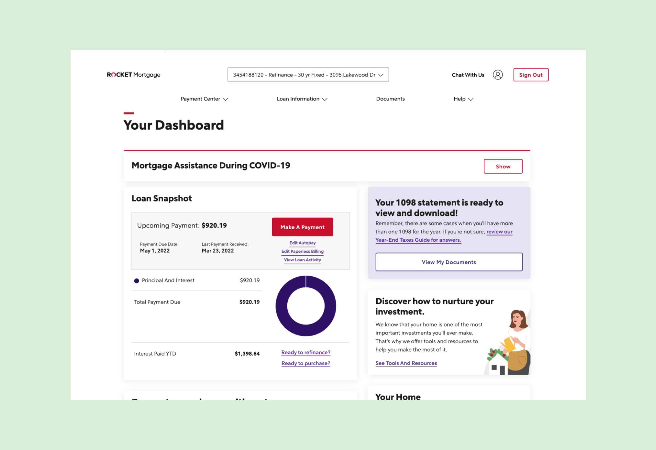
Before
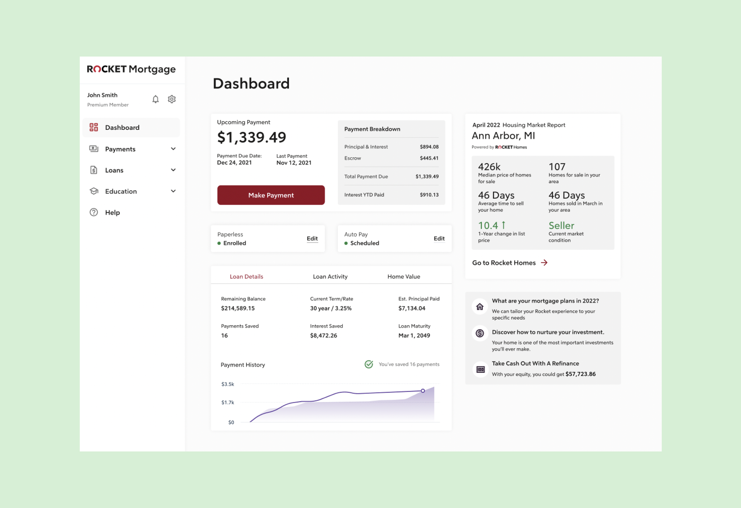
After
Rocket Home
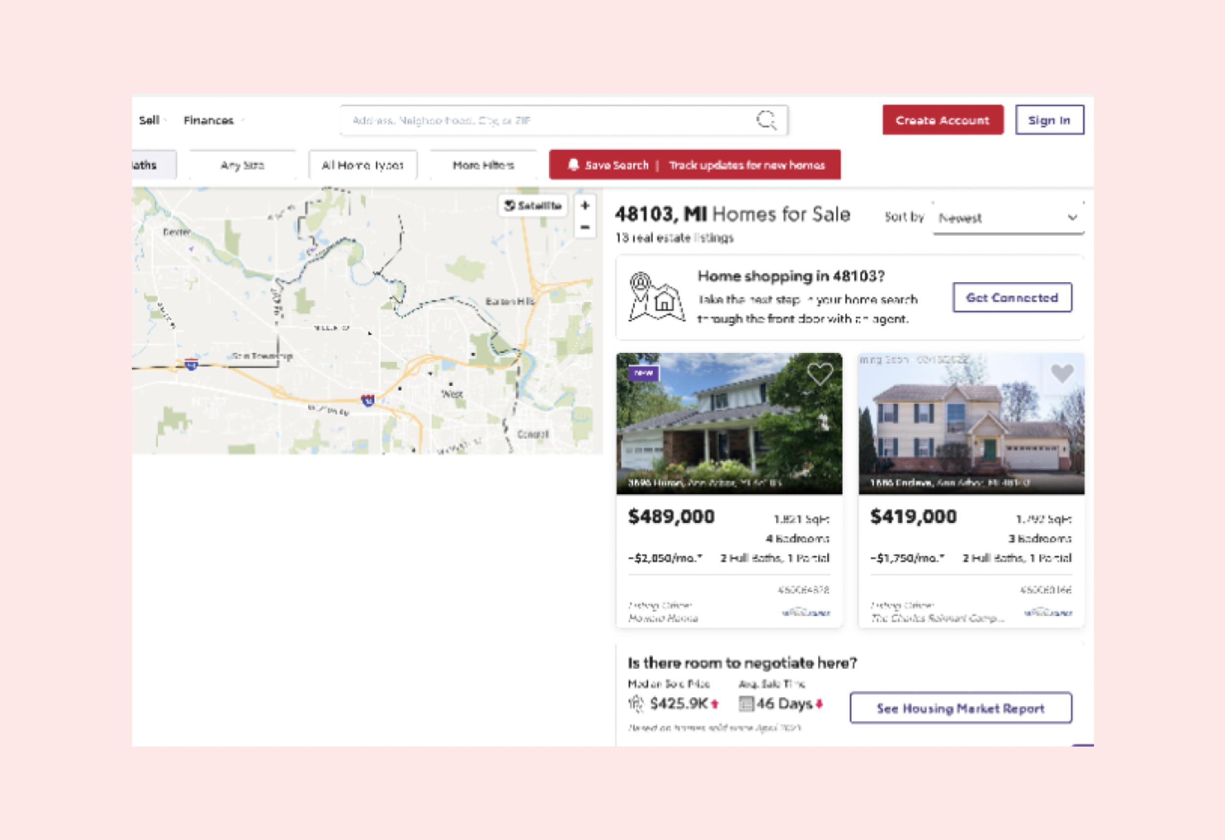
Before
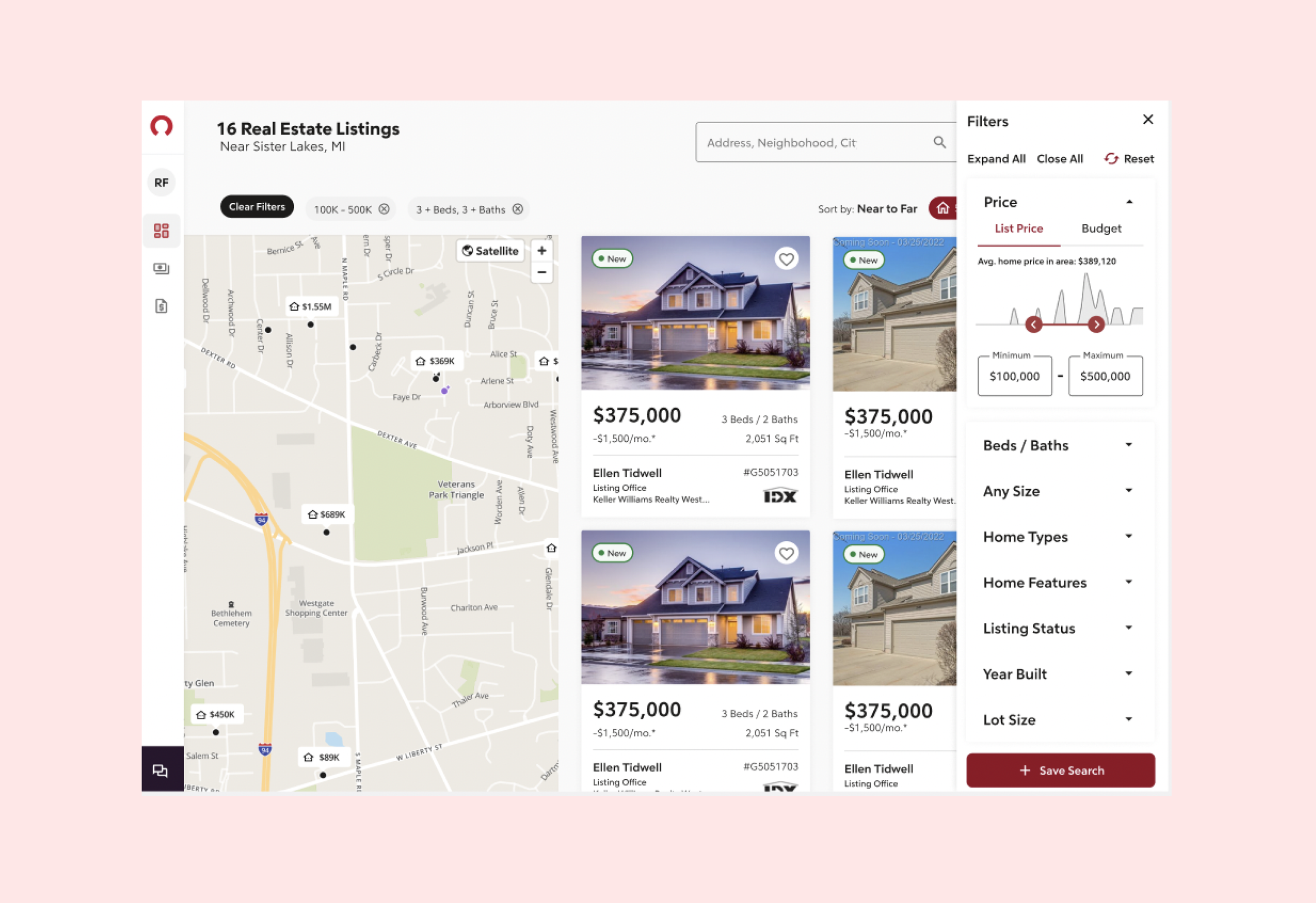
After
Rocket Mortgage
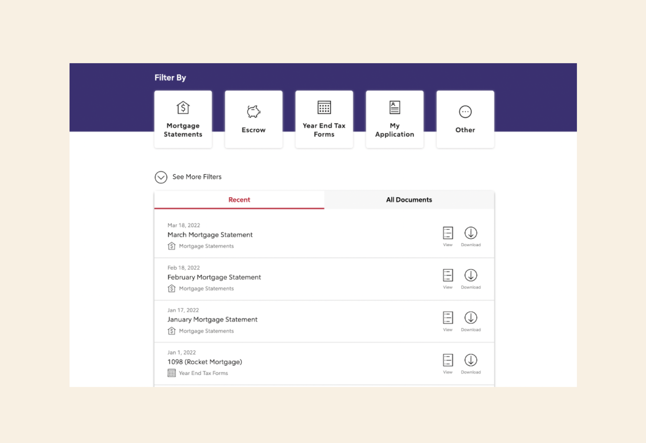
Before
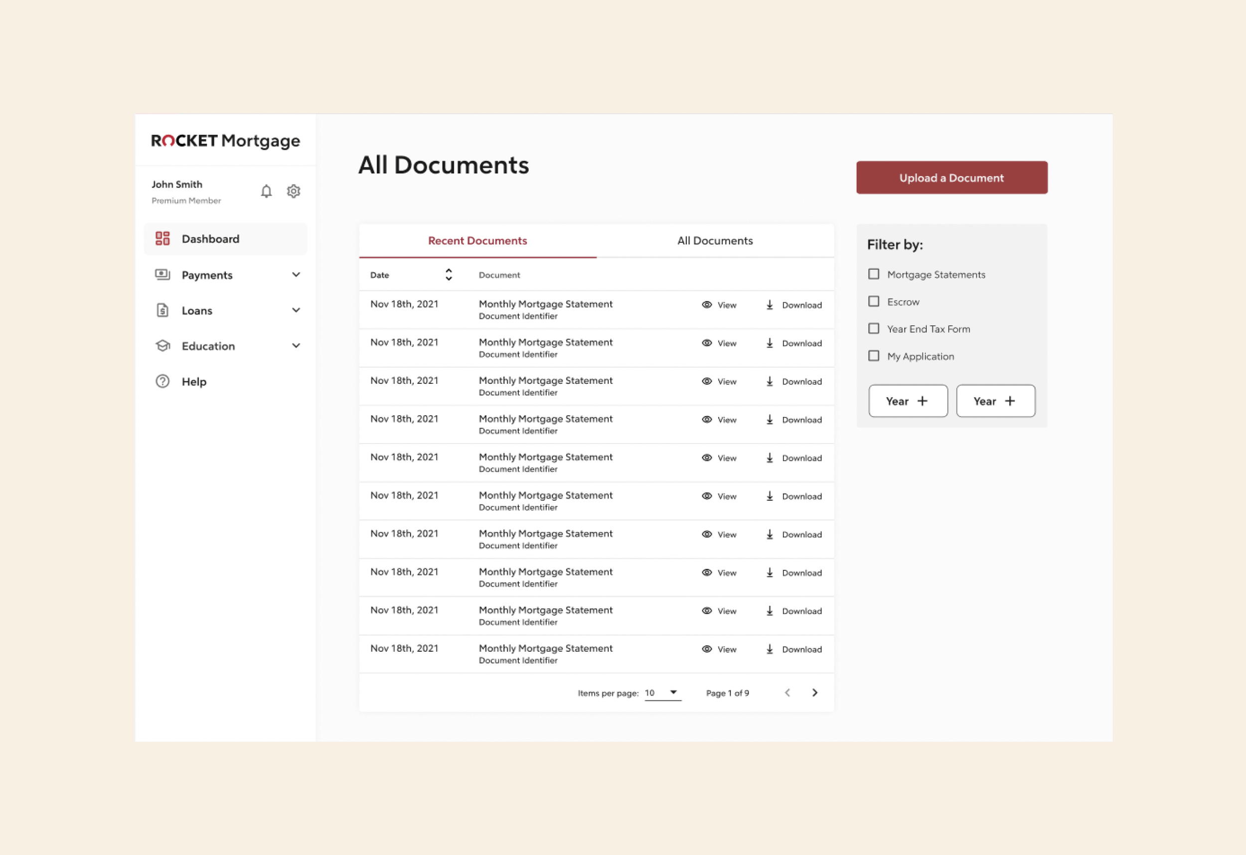
After
Rocket Mortgage
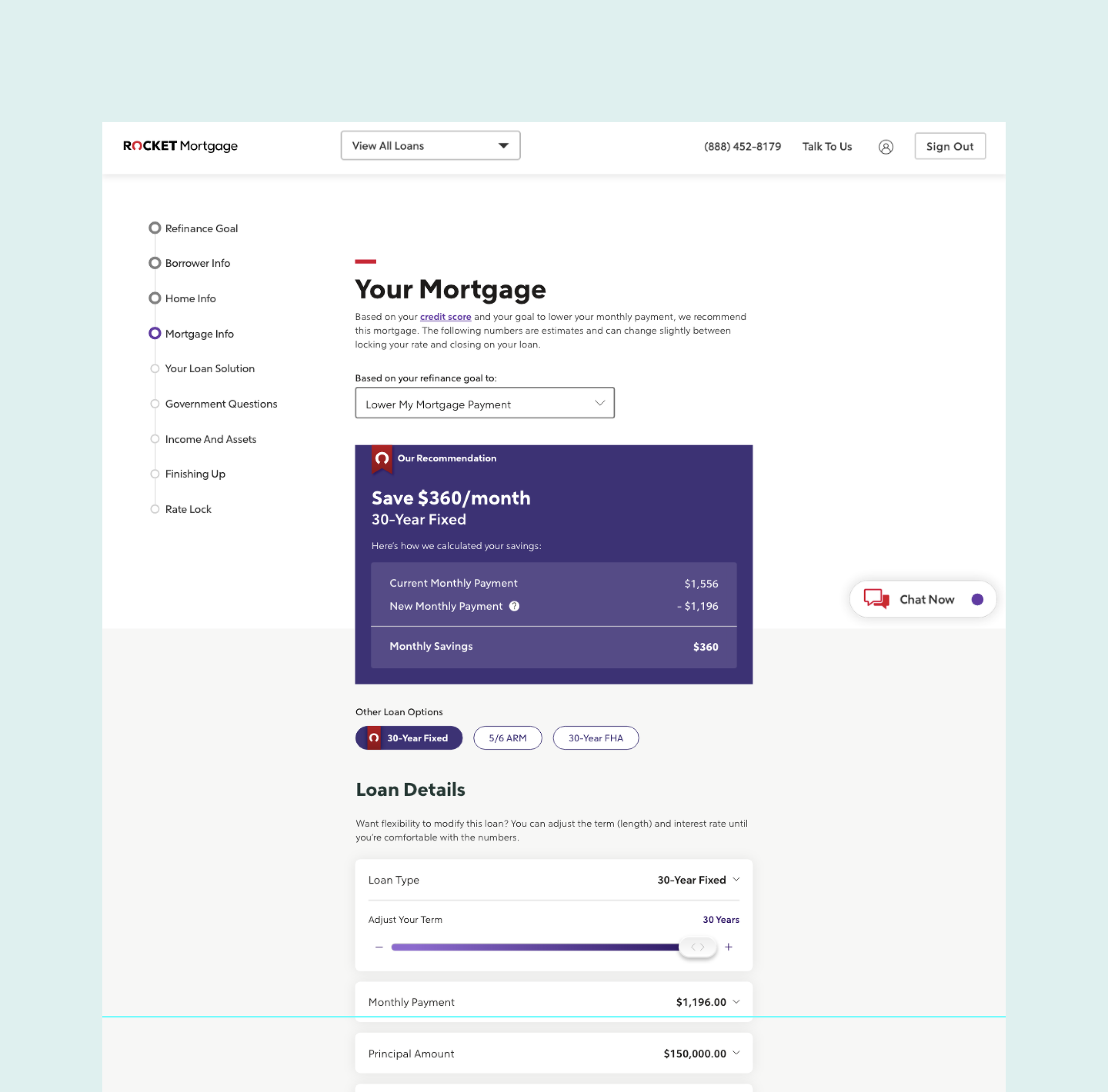
Before
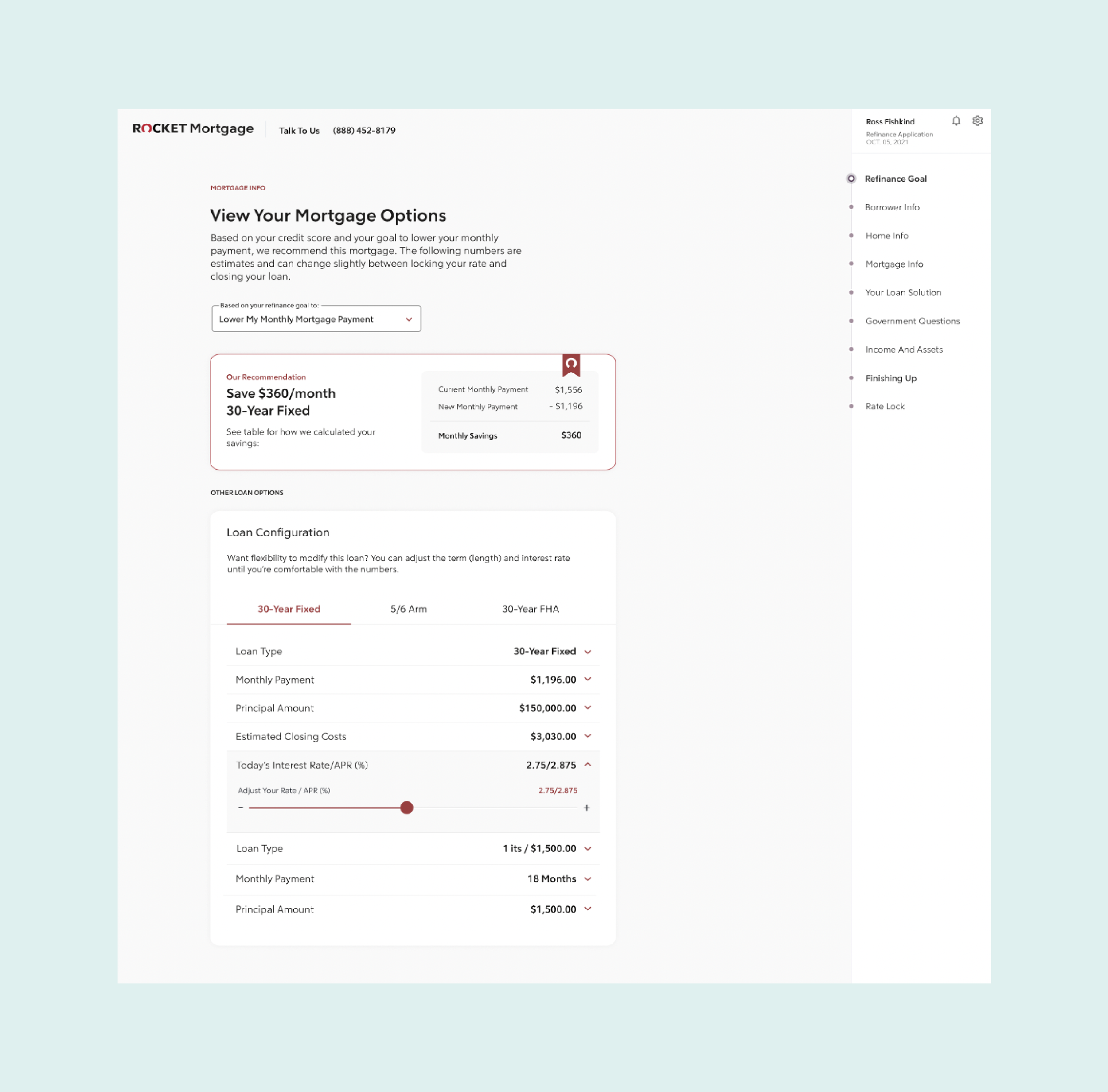
After